We get it, app store testing can really boggle your mind! There are so many individual elements you could test… how do you know where to start? Easy: start with the first impression, as this is the only frame that a vast majority of users will see.
Check all other articles in our Ultimate App Store Test Series:
Part 1: Building Hypotheses
Part 3: Driving Traffic
Part 4: Analyzing Results
As you’re probably aware, the first impression frame is full of individual creatives, from your app’s icon to its videos and screenshots. This means creating and optimizing your creatives is paramount to the success of your app.
Well-crafted creatives will help you boost your conversion rates, of course. But they’ll also help improve multiple factors within your app store page ecosystem. Higher conversion rates lead to lower cost per acquisition metrics, which grow installs that impact rankings. Better rankings result in more search traffic… You get the picture.
In this article, considering you read the first part, we’ll teach you everything you need to know about creating effective creatives so that you can grow your app business to new heights. Let’s get started!
What Makes a Great App Store Creative?
To create and test great app store creatives, you should know what a great creative actually looks like. Contrary to popular belief, a great creative doesn’t have to be sleek, sexy, or ultra colorful. In fact, some high-performing creatives are quite ugly…
The key is distinction.
The creatives you design and test should each have distinct styles and messaging. That way you can easily determine why one raises conversion rates more than another. Without knowing the why, you won’t be able to repeat your success.
Distinct Styles
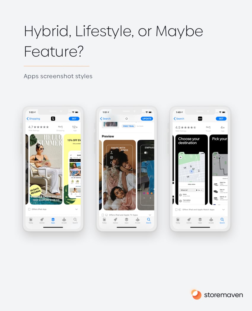
Let’s take some time to cover the eight main screenshot styles you can use in your app store product page — three for apps and five for games.
For apps:
- Lifestyle: This app screenshot style uses real-world images to forge an emotional connection with visitors. It’s best for apps without high-quality UI.
- Feature: The feature-oriented style shows actual screenshots of an app in use to illustrate its capabilities. It’s recommended for apps with great UI.
- Hybrid: Hybrid screenshots combine elements of both lifestyle and feature styles to emotionally connect with visitors and highlight top app features and UI.
And for games:
- Gameplay: This screenshot style depicts tactical gameplay elements to show users how a game operates. This style is perfect for hardcore gamers.
- Character: A character-oriented screenshot emphasizes a character or group of characters within a game and is an ideal choice for brands with recognizable IP.
- Feature: As the name suggests, a feature-oriented screenshot highlights a specific feature within a game. This style can work well for games that excel at storylines.
- Art: While not common, an art-style screenshot combines game assets in a visually appealing way. Sometimes this style can draw user attention due to its uniqueness.
- Hybrid: A hybrid screenshot combines multiple design styles with the aim to create something engaging, informative, and original.
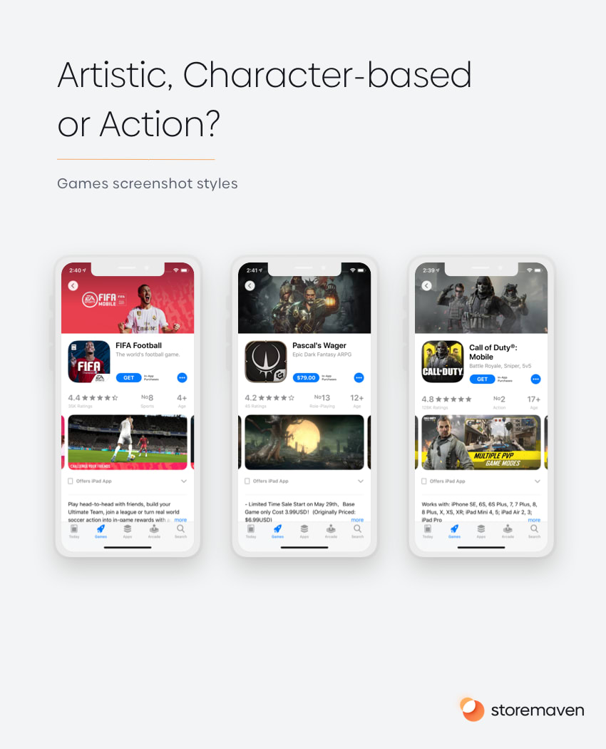
The screenshot style(s) you use will depend on your specific game, its target audience, and the unique selling propositions (USPs) you want to highlight.
Of course, your screenshots aren’t the only creative you’ll want to optimize. Pay special attention to your icon, feature graphic (Google only), and videos/app previews. Each of these elements helps determine whether users download (yay) or drop from your product page (boo).
Distinct Messaging
The way your creatives look is only half the battle. You’ll also want to pay attention to your messaging to ensure it’s distinct. We have two rules!
- Avoid Meaningless Words: Don’t have anything to say? Then don’t say anything. You don’t have to include words in your creatives. If the design says everything you want it to say, skip the text. It will just muddy up the image and make it less clear. Everything you do when you create app store creatives should have a purpose. If you can’t pinpoint a reason to do something, don’t do it.
- Use Captions and Text Carefully: Captions and text can add context to the screenshots, videos, and other creatives you design. But they need to be crafted with care. Remember, most of your audience will be looking at your app on their phones. Make sure your messaging is legible on a small screen. Additionally, cater your messaging to the specific audience you’re targeting with each test.
Follow these two rules and your messaging will be distinct and much more effective.
How to Turn App Store Hypotheses Into Creatives
The process of turning a hypothesis into a usable creative is more challenging than it sounds — mostly because there are multiple steps, stakeholders, and data points to juggle. But don’t worry, we’re going to unpack everything for you here.
1. Understand the Data
The first step in the hypothesis-to-creatives process is to collect and analyze the data available to you. This includes both general App Store and Google Play store details as well as data points that apply to your app or game specifically.
In General
Let’s start with a bit of general information…
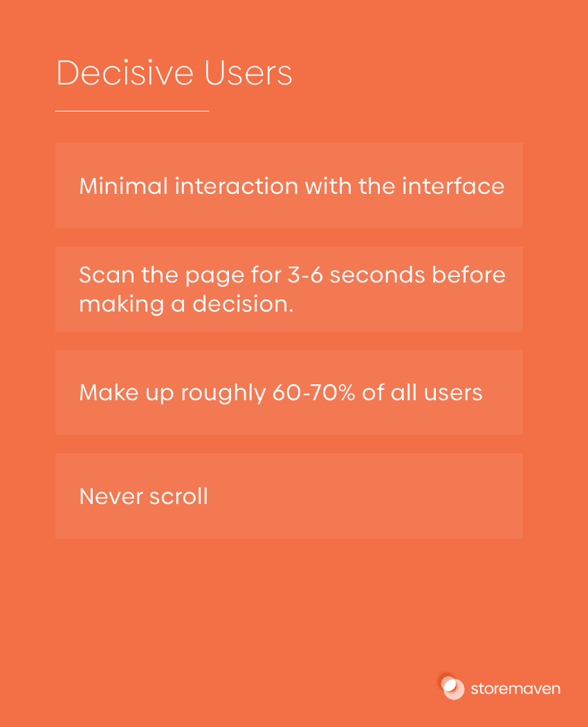
App store users can be separated into two categories: Decisives and Explorers. A Decisive user is one who decides to download an app (or not) in six seconds or less. They quickly scan the product page and then take action. 60-70% of users fall into this category.
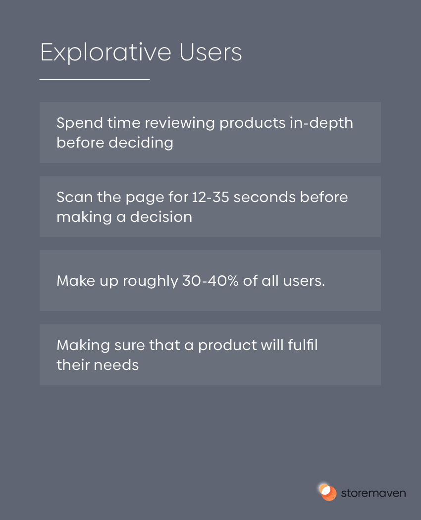
Explorers, on the other hand, are much different. They take their time to scroll through and analyze every creative and piece of information. They want to be sure the app in question will fit their needs before purchasing. 30-40% of users fall into this category.
Since a large part of your target audience will be Decisives, the first impression frame (everything on your product page that can be seen without scrolling) is essential. In fact, our research shows that an optimized first impression can boost conversions by up to 26%.
More Specifically
Okay, now it’s time to dig into specific data about your app or game…
The Apple App and Google Play stores don’t always make it easy to learn about user behavior. But that doesn’t mean you have to fly blind, there are plenty of ways you can research your target audience and use the information to improve your creatives.
- View Your Engagement Metrics: Tools like App Store Connect and Google Play Console will help you analyze general user behavior on the app store e. Learn how your audience discovers your app, the percentage of visitors that convert, sales trends, and more. Then use the details to craft more effective creatives.
- Read Reviews and Feedback: What do your current users love about your app? And what drives them crazy? Use this information to help you craft better creatives. For example, if reviewers consistently mention that they love the characters in your game, create a character-oriented screenshot to display.
- Analyze Your Marketing Data: You can learn a lot about your target audience by analyzing your marketing data. We’re talking about Adwords campaigns, social media marketing efforts, and other off-app store channels. Use these platforms to glean user information you can use to inform your creatives.
It’s important to know how the average Apple App Store and Google Play store user behaves. It’s even more important to understand how your target audience goes about installing apps. Dig into your personal market and metrics when making creatives.
Bringing it All Together
So you know that most of your users are probably Decisives, which means your first impression is vital to the success of your app or game. You also know a few different ways to uncover data specific to your app or game.
The only thing left to do as far data analysis goes, is take your hypothesis, combine it with the details we just uncovered, and then use it to craft a stellar creative. For example:
If you hypothesized: “My users will engage better with a character-themed creative than a gameplay oriented one,” you simply need to design an app store first impression that features your most popular character so that you can run a test and see if your conversions rise.
2. Communicate With Designers
The second step is to clearly communicate with your design team to make sure they understand what you want your creative to look like. This is usually done by writing a design brief that includes target audience, competition, tone and feel, and the goal of the specific creative being tested. Let’s talk more about that…
Write Awesome Design Briefs in 5 Steps
A design brief is a written document, usually just a page or two, that explains the goals of a design project, the scope of work to be accomplished, and clears steps for designers to take. Here’s how to write one in five easy steps:
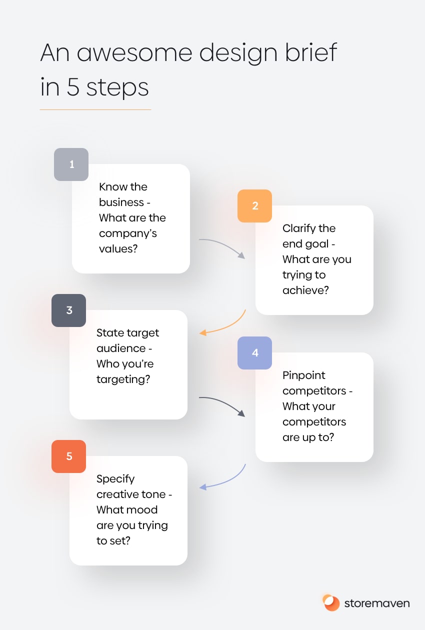
- Know Your History: Remind your design team of your company values and describe your business in layman’s terms that anyone can understand. You’re NOT trying to sell here. You’re simply explaining your business in exciting ways.
- Clarify the End Goal: Tell your designers what you’re trying to achieve with this creative! The more they know about your goals, the better they’ll understand your vision and be able to craft visual assets that support it.
- State Target Audience: The target audience plays a huge role in what your creatives look like. Tell your design team who you’re targeting so they can use this information to inform their creative decisions. Include audience age, gender, intent, and more.
- Pinpoint Competitors: When your designers know who you’re competing with, they can use the competitions’ images to inspire their own. They can also craft creatives that feel fresh, and differentiate your app from others in its category.
- Specify Creative Tone: Lastly, tell your design team the tone (AKA feel) you’re going for. What mood are you trying to set with this creative? This will help them choose colors, fonts, image types, and more.
Assemble all of this information into a short document that you can pass to your designers. Trust us, they’ll appreciate the direction and you’ll enjoy better creatives in less time. Win.
A Few Design Examples
Your design brief isn’t the goal; amazing app store creatives are. With that in mind, Let’s look at a few pages that get the job done. You can read more about great App Store pages and what makes them perfect here.
#1: Square Point of Sale – taking testing to another level
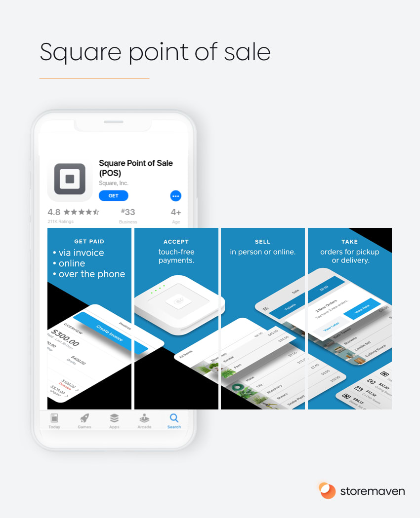
Square’s Point of Sale app is an example of a B2B app that followed a specific testing progression to create that specific page. Square’s teams understood that, through testing, users preferred a video that opened with the messaging, “Accept all types of payments” (which embodies its main value proposition) and then was followed by, “the app to run and grow any business” (which points to the conceptual goal of the app).
For Square Point of Sale potential users, after testing various value propositions, it was the “accept all payments” message that worked best and aligned with what small business owners actually want to accomplish or what they value most about a payment service.
The design style was set after Square conducted two rounds of screenshot design tests. They came to the conclusion that users respond best to a page that aligns with Square’s brand (as its brand is quite strong), but with a refreshed look.
#2: Grab – a portfolio of services
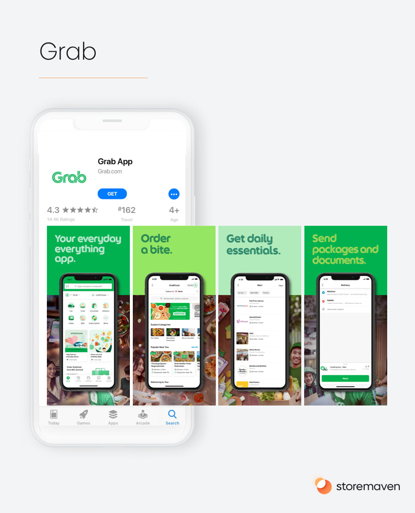
The ride-hailing, food delivery, and cashless payment app Grab, from southeast Asia, uses an interesting landscape screenshot on Google Play. It features a large caption that illustrates the app’s overarching mission, the brand, the phone UI, and a real-life view of the user experience all in one shot that doesn’t look too crowded.
With many different offerings, Grab showcases each of their important traits separately—in bold letters and short words—in a way that ensures everyone can find one benefit most relevant to them. Grab understands that there are many uses for their app, and they need to separate and test their different services to see which one their audience responds to most optimally.
The clear style, unusual font, and unorthodox color palette form a unique, holistic look that is hard to achieve, especially when mixing themes such as lifestyle and feature-oriented.
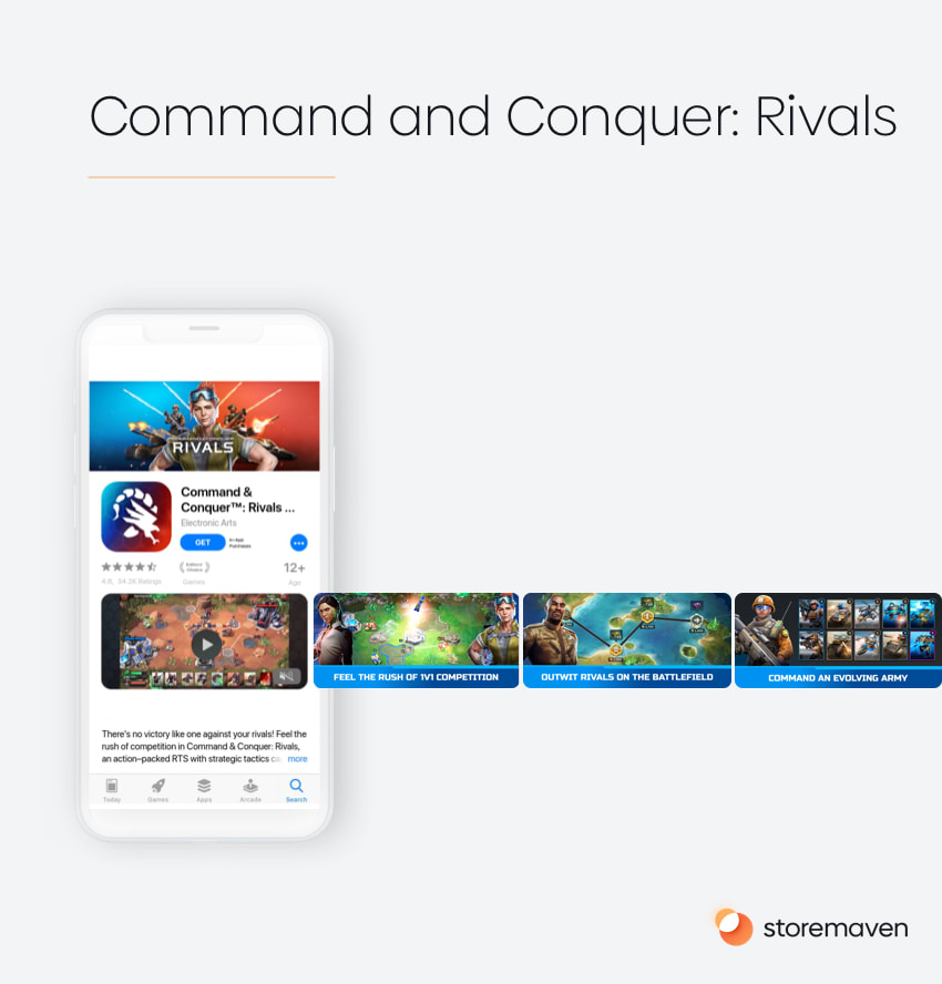
#3: Command & Conquer™: Rivals – combining gameplay, characters, and art
In this example, Electronic Arts (EA) combines three design elements to hammer down the most important and effective messages for this type of game.
Command & Conquer Rivals is a result of a brilliant strategy of using an “old” and well-known Intellectual Property (IP)—the original Command & Conquer PC strategy game. Rivals brings back to life a game that was loved by millions in the ’90s and adjusts it to their current habits (now that they’re in their 30’s-40’s and probably have less free time) with a short Player vs Player style experience.
Tailoring their messages to that existing fan base, EA knew they needed to tackle a few things:
- The art—showing art that conveyed the feeling of the original game world that people love.
- The gameplay—showing that this is a game that can be experienced at an extremely fast pace with short PvP sessions.
- The characters—wisely using well-known characters throughout their app store assets to lure in the original fan base that was emotionally connected to these characters evokes a feeling of nostalgia.
They managed to hit all three points with an extremely effective video that combines all elements designed in an optimal way (fast-paced, divided into short chapters, each covering a different game proposition) with a fantastic gallery that is a hybrid between showcasing the characters and gameplay.
The Importance of Culturalization
It’s important to note that your creatives should cater to the markets they’re displayed in.
For example, your screenshots in the US Apple App store and the India Google Play store, should look different because they’re targeting different groups of people.
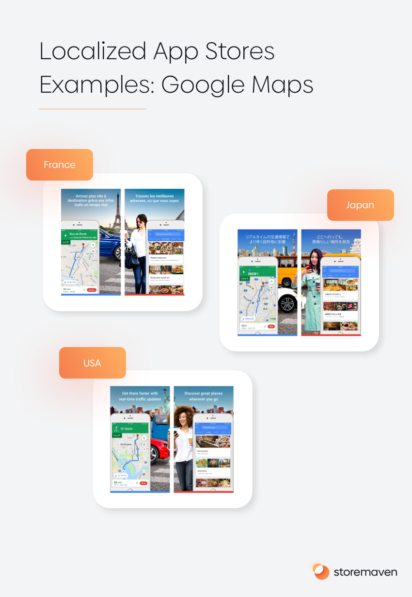
This information needs to be communicated to your design team as well, otherwise, you’ll have optimized creatives for just a single market. You can read more about localization and culturalization in our special guide.
3. Place Your Creatives Properly
The third step is to place your creatives in advantageous spots. Since there’s only one place to put your icon, app preview, etc. we’re really just talking about screenshots and videos here. But screenshot optimization can boost CVR by 28%, so it’s really important!
App marketers who create new screenshots and place them at the end of the gallery for testing are missing a trick. Can you think why? Yep, because our research shows that less than 1% of users will make it to the end of your product page’s gallery in the Apple App Store. Google Play isn’t much better (less than 4% of users view the final screenshot).
If the creatives you test aren’t placed in the first impression, very few users will see them, which means you won’t get the data you need. Or worse, you’ll get inaccurate data.
Furthermore, autoplay videos in the Apple App store lower the chance of scrolling by an additional 11.9-22.8%. Meaning, creatives that appear after autoplay videos have a much lower chance to get watched at all and need to be placed at the front of the gallery for proper testing purposes.
Drive Traffic to Your Creatives
Once you’ve analyzed the data to decide how your creatives should look, created a brief to send to your design team, and received images back, it’s time to drive traffic to your app product page (complete with a new creative that reflects your hypothesis).
If you don’t have your own in-house team, Storemaven’s creative studio offers product page design services that create beautiful data-driven designs.
That’s part two of our Ultimate App Store Test series complete, great work – we smashed it together! Stay tuned for part three coming soon – when we’ll look at the actual test mechanism and methods.


