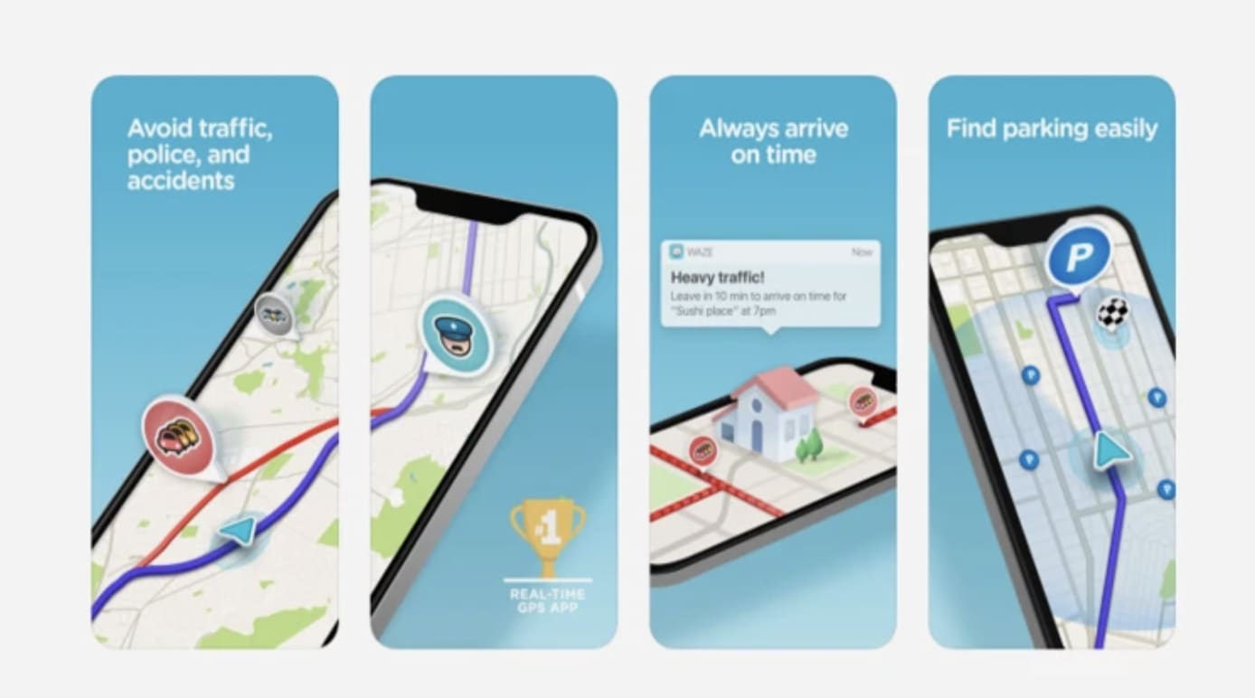
The Screenshot Gallery is a place to showcase your app’s features, illustrate key value propositions, and ultimately encourage visitors to install your app. On the Apple App Store, the Screenshot Gallery is a highly important component of an app’s Product Page since it appears within the First Impression Frame.
Almost 100% of App Store Product Page visitors are exposed to marketing assets within the First Impression Frame before being influenced to either install an app or leave the page altogether. In fact, our data shows that 50% of all installs come from the First Impression.
A recent trend in app store marketing is the implementation of Panoramic Screenshots, which is a design strategy used to encourage Product Page visitors to scroll through the Gallery. While Panoramic Screenshots have been found to be extremely successful in encouraging visitor engagement, there are a few design-related issues publishers face when trying to implement one on their Product Page in iOS.
This guide will help you circumvent these challenges and offer best practices for designing Panoramic Screenshots for your App Store Product Page.
But first…
What is a Panoramic Screenshot Gallery?
Panoramic Screenshots include a design which spans two or more App Preview Screenshots within a Gallery. This design strategy is used to create a holistic First Impression Frame (both in the Search Results Page and the Product Page) and, as previously mentioned, encourage visitors to scroll through the Gallery.

Challenges in Implementing Panoramic Screenshots
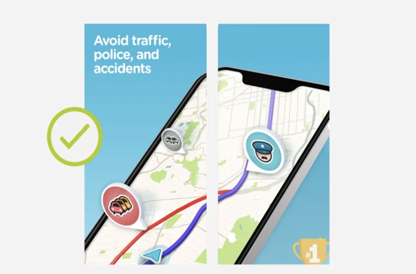
When implementing Panoramic Screenshots on the Apple App Store, many designers ignore the gaps between Screenshots when designing Panoramic Screenshots. As a result, the Screenshots look disconnected and not accurately aligned.

When designers do keep this space in mind, the brain easily fills in the gaps, and the Screenshots appear as one continuous image.

It’s imperative that designers are familiar with the size of this gap so they can take it into consideration when building out the design.
Unfortunately, each device has its own unique gap dimensions, and since the web store is responsive, there is no assurance that the gap ratio will be the same across all screen resolutions.
Panoramic Screenshots Design best practices for Apple App Store
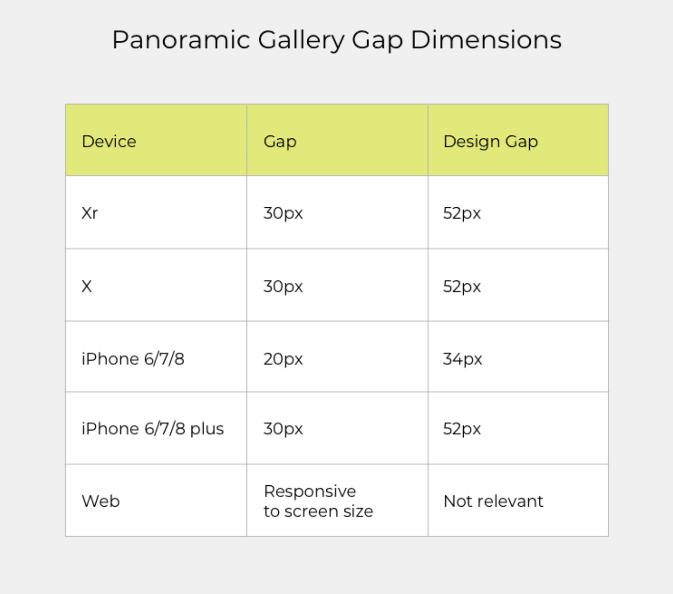
We went ahead and created a table for you with real store gap dimensions and the design gap dimensions designers should be using when creating Panoramic Screenshots.

For example, if you’re designing a Panoramic Screenshot Gallery for iPhone X, you should keep a 56 pixel space between each Screenshot while you’re designing. This will ensure the Panoramic Screenshots are perfectly aligned when live in the App Store.
Please note that the real store and design gap dimensions are different because the original Screenshot is much larger than what is eventually displayed in the iOS App Store.
If you want to make life easier, just stick with the gap dimension for iPhone X. This will look the most accurate across devices.
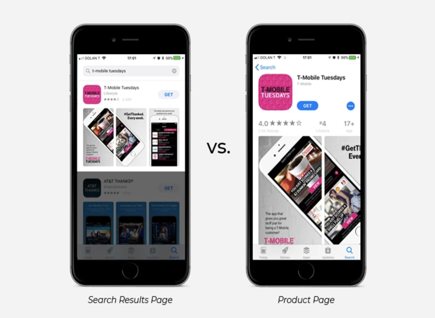
Another thing to consider is how your app looks in the Search Results Page. The proportions on the Search Results Page are slightly different than on the Product Page. More specifically, Panoramic Screenshot Galleries that look perfect in the Product Page will look a little off in the Search Results Page, and vice versa.

Although the difference is minimal, above you can see the discontinuity of the images spanning both Screenshots in the Search Results Page.
We recommend optimizing for your App Store Product Page since it’s a larger and more important representation of your app. The slight inaccuracy on the Search Results Page isn’t noticeable enough to warrant optimizing solely for that page.
Alas, it’s a little more complicated on Google Play since they allow you to upload varying App Store screenshots sizes and ratios. If you need help designing Panoramic Screenshots for Google Play, check out this piece.
To learn how to design panoramic screenshot galleries for Google Play, check this piece.


