The Storemaven team is always sifting through the app stores in order to spot and microscopically analyze current ASO trends across categories and verticals; it’s kind of our thing. Think of us like those tour guides you see at art museums, explaining and decoding pieces to the visitors who want to hear all the must-knows and conclusions (without the need themselves for an expensive college art degree).
We’re happy to share our notes with you and keep you on top of app store trends, what’s working (yay), what’s not (boo), and provide you with plenty of ideas for App Store tests and Google Play experiments, all in the name of improving your app store conversion rates. Boom.
What you can expect from this analysis:
- To understand the App Store Optimization messaging strategies of the top apps in the Finance category.
- To generate ideas for experiments that you can run on your app store page.
Disclaimer: All data and information in this report are based on publicly available information. All assumptions based on the strategy behind app store creatives are based on Storemaven’s expertise and experience.
Today we’re starting with the Finance category. Are you ready? Let’s go.
Category Snapshot
For the purpose of this analysis, we’ll mostly focus on the US market.
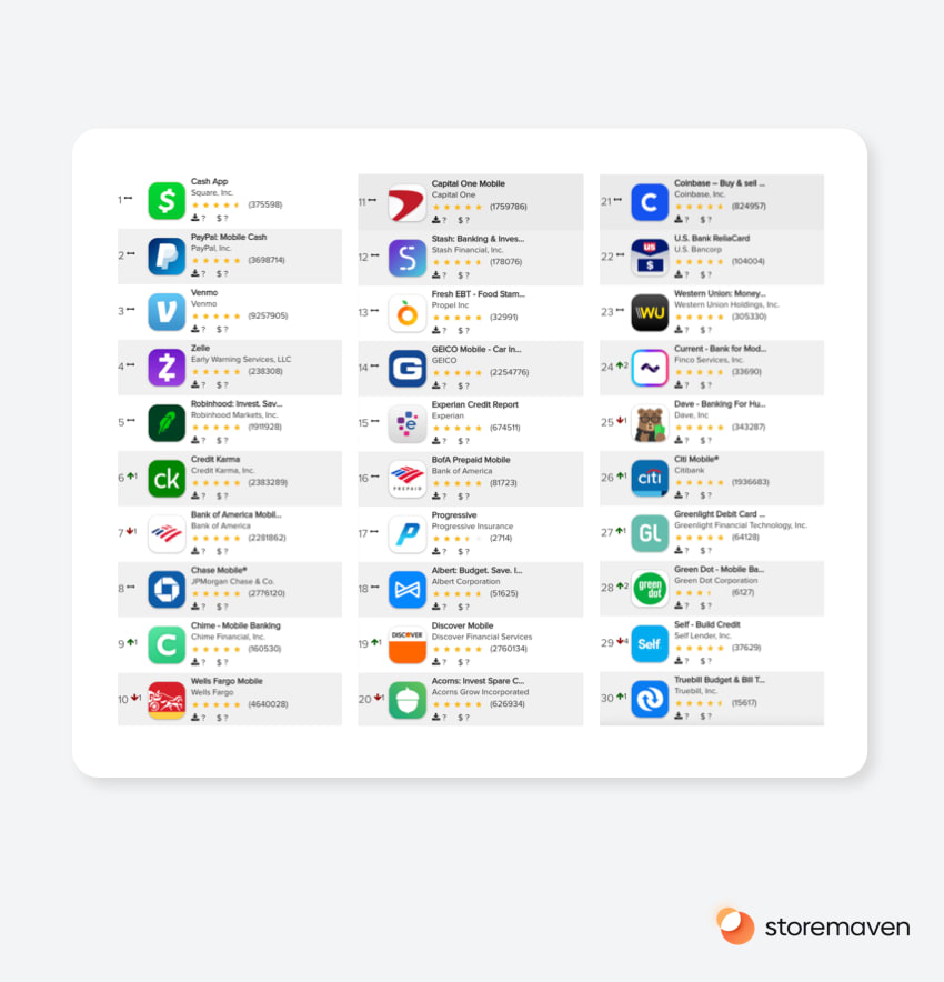
These are the top 30 free Finance apps in the US as of August 3rd, 2020. You might recognize a few of them and even have some of them on your devices.
Let’s start breaking down their app store marketing messaging based on their creatives.
Finance app Icons: Breaking the convention
As you can see, 96.6% of the top Finance apps take a branded approach with their app icon. That shouldn’t come as a huge surprise as many of these apps are part of a large financial corporation that created significant brand capital over time; by being part of the Finance world, which is a traditionally ‘corporate’ industry, none of us expect an abundance of off-the-wall branding.
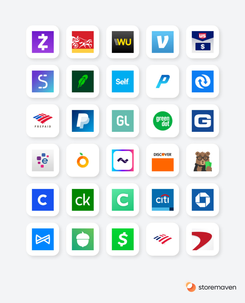
The more recognizable the brand logo, the more chances it has to lead to better performance, as users will immediately associate the app with a brand they already know (and that they hopefully have positive associations with).
That said, several newer brands that adopt this strategy but have less recognizable brand names might miss out on an opportunity as they’re competing with the larger ones.
The one brand that took a different approach here is Dave, a relative newcomer to the industry.

Unlike the vast majority of Finance app icons, Dave’s marketing team didn’t go with a brand logo as the app icon but chose to go a more unconventional route by using a character – the signature Dave bear. This icon choice portrays Dave the app, and the brand, as different from the other Finance apps. The strategy of using a character (a practice mostly used in mobile games) can attract and pull in users who like to break with convention; users that would immediately understand there’s something different about this particular app, and they might even associate it with a game-like experience.
As for Finance icon colors, we can see that the norm in Finance (even outside apps) is pretty much consistent in the app store, with blue, green, and purple leading the pack. Not much vivacious neon pink or canary yellow, I’m afraid.
We’ve used AI to analyze the distribution of the color in the top 30 icons, and we can reveal the following mix:
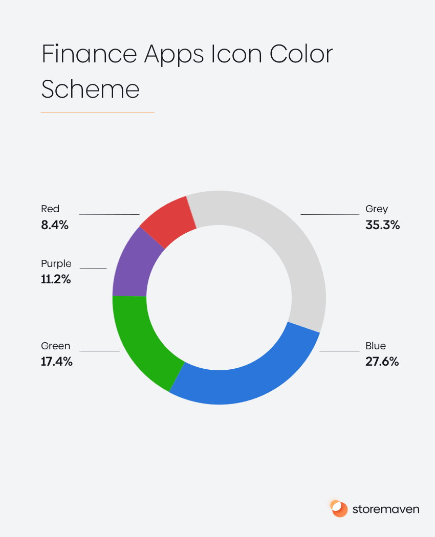
This means that for newer brands with less brand capital, it’s worth experimenting with unique or different icons to stand out and increase the probability the app will get more interest in the form of click-through rates and install rates. By conveying a message of differentiation, it’s possible to entice users enough to galvanize them into exploring the app store page further.
Finance apps’ app store videos: Roll the tape
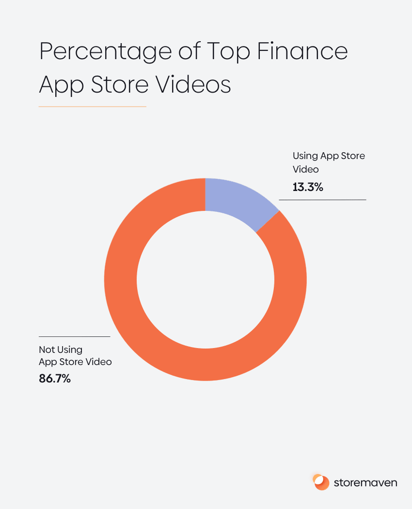
Looking at video usage in the App Store for the top 30 finance apps, we noticed something significant. Maybe Finance people are late for the movies and never catch the trailers (and therefore don’t understand how important they can be) because the vast majority of Finance apps do not use videos. Only 13.3% of apps use them. Implementing videos into an app store page would open up an opportunity for Finance apps to grab users’ attention, especially by using autoplaying videos (within the search results page).
Our research shows that videos are a great tool for communication and tell the app’s story to users. But unless it’s done right, it can also harm conversion rates. If the messaging within the video isn’t exciting enough for users, they’ll lose interest and drop out of the page. Or if there’s too much information to absorb, it can overload users. You need a perfect balance. According to our data, videos can have an impact of between -20% to +20% on conversion rates, depending on its content. So it’s a gamble, but it’s one that can definitely pay off.
Now, it’s time for some hard truths. Our analysis of some of the videos in the Finance category shows there’s a common thread that might actually be hurting conversion rates:
1. The use of content that doesn’t connect emotionally with users (there’s limited usage of “lifestyle” imagery within the screenshot gallery).
Many of the videos within the finance category focus on features as opposed to the benefits for end-users. We say “out with the features, in with the benefits.” Users are looking to get jobs done and to see the tangible/emotional benefits they can uniquely experience using an app.
Think about the following as enjoyable ‘hooks’ in which to hang your marketing message. Are users looking for various mobile banking products or a way to manage their money? Maybe they’re fed up with the customer service of large banks treating them like numbers on a screen and not like humans? Maybe they’re looking for a way to get the job done without waiting hours in extension limbo for a representative, or perhaps they’re simply fed up with needing to go to a physical bank to perform simple actions?
Experimenting with these types of messages and attempting to connect emotionally with users could uncover leverage that increases conversion rates by marketing what people really want from a finance app, as opposed to just another feature that 1,000 other apps are offering too (and don’t differentiate you from the rest).
2. Using the first 1-3 seconds for a logo-oriented splash screen.
Based on our data, users watch videos for about 5.5-6 seconds on average. No, that’s not a very long time at all. Yes, we’re sure. So, with that short time frame, the earlier a message appears in the video, the higher the number of users that are exposed to it. A video may have a really strong and converting message, but if that message is located on the 15th-second mark, it’s going to make very little impact on moving the needle on conversion rates; users simply aren’t waiting around to watch.
What does this mean? It means that the first 1-3 seconds of an app store video is the most important real estate you have. So you need to think about what message you can deliver in a maximum of three seconds. Wasting it, excuse me, I mean spending it on showing your app logo (which is also visible, in most cases, within the app icon) might not add enough value to users for them to install. They already know they’re on your brand’s app. Have a brainstorm and think about your options for a maximum three-second video.
Even one second is almost 20% of the time you have with the average user.
3. Using small UI (user interface) elements and a font-size that are hard for users to read on a small device.
Users lose attention fast on the app store. Like, Usain Bolt fast. On average, around 65%-70% of users make a decision whether to install or not in 3-6 seconds. With this time frame, any marketing messages that are conveyed through a lot of small UI elements and in a small font size have a much lower chance of being understood by users, as you can see in this example.
Finance apps’ app store screenshots: A picture paints a thousand words
To understand the app store messaging strategy of top Finance apps, one can learn a lot by analyzing the message behind their screenshot galleries.
Before we dive in, it’s important to say there isn’t a “right” or “wrong” messaging strategy, and different apps might have different audiences they would go after (e.g., more/less tech-savvy or, more/less finance savvy). The only scientific way to know which messaging strategies will lead to higher conversion rates (from the audience you care about the most) is to run controlled app store page tests.
After analyzing the top 30 apps’ screenshot galleries, we noticed three leading messages.
1. Ease of use
About 34.3% of apps are leading their app store page with a message around ease of use. Great. But is the app actually easy for everyone to use?
Consumer Finance is an area that intimidates many users who aren’t tech or finance savvy (some people still keep their money under their beds). Users with limited tech or finance knowledge want to know that the product they’re choosing will really be easy to use, will simplify their financial lives, and can untangle the complexities that come with managing finances.
Although the message conveyed to users through the first two screenshots has a very significant impact on the probability they’ll install, the way this message is delivered and conveyed through the design style is also important (70% of users will make their decision based on the first impression — the above the fold area of an app store page — where only two screenshots are visible).
When you think about it, what might really bother users who will be driven by a message of “ease of use” would the sense of “superiority” that surrounds finance, combined with a strong feeling that you have to be savvy, to use Financial products.
So it’s easy to see why conveying this message through showcasing app UI (unless the UI is phenomenal, unique, and really shows the ease of use) might be hurting conversion rates as these users still don’t perceive it as accessible and easy.
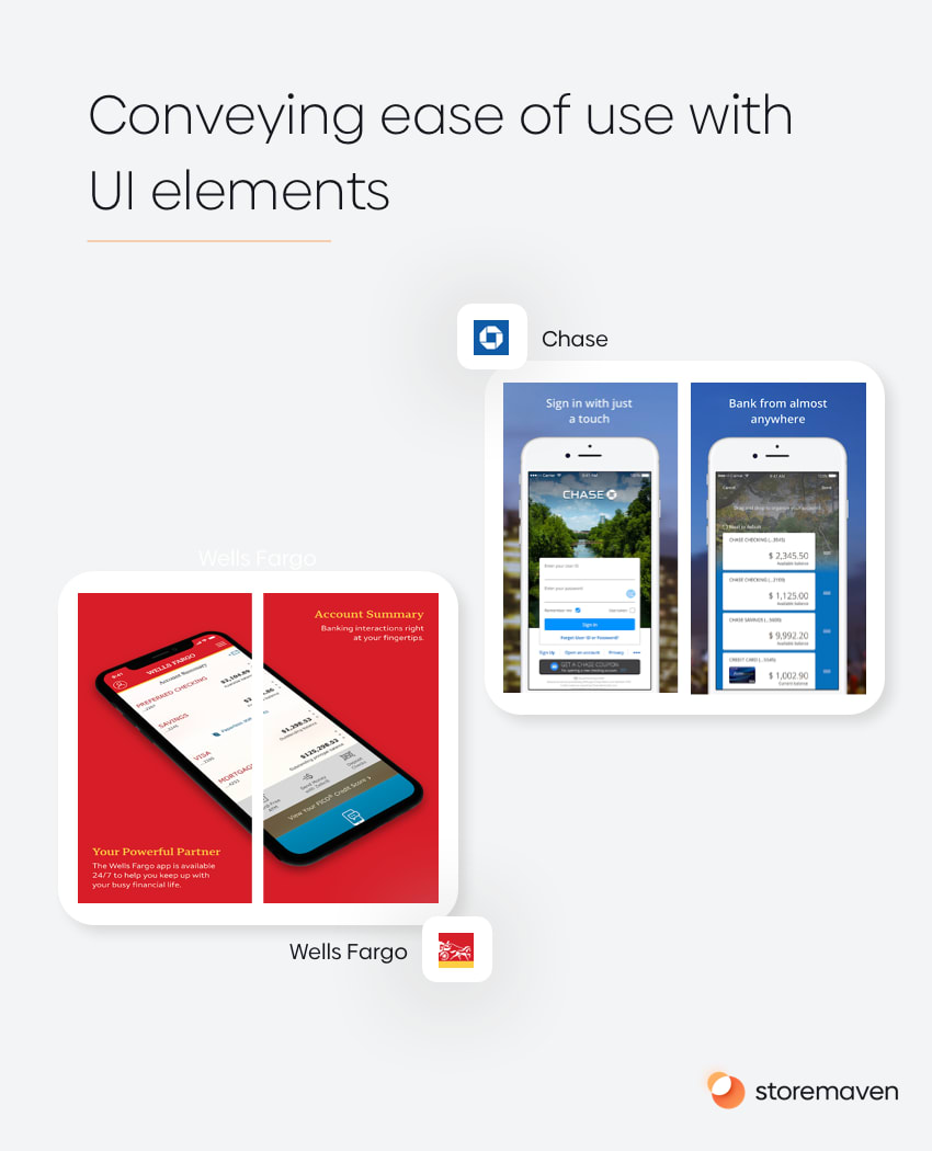
Although the text in these screenshots conveys ease of use and availability, by glancing at these screenshots (which our research shows users do remember the whole ‘around 65%-70% of users decide whether to install or not in 3-6 seconds’ bit), users still see a busy UI and could conclude it’s actually unappealing to them.
A few of the money transferring apps are conveying the same message by connecting it to users’ lives/experiences and everyday use, which might work better for a less savvy audience.
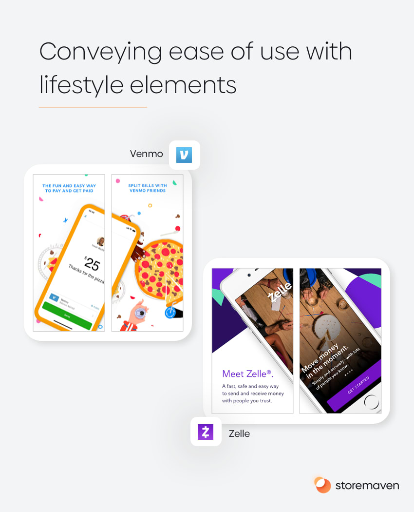
By connecting the ease of use message to creatives that show the actual everyday use (eating with friends or having a birthday party and splitting costs) users could receive that message in a much better way. The UI in these screenshots is simple and focuses only on the ease of use, showing you that you can send money/get started with 1-click.
2. Lifestyle images
One design trend that’s lacking in the Finance category is ‘lifestyle.’ Given the challenges with conveying accessibility, ease of use, and simplicity, using real people within the creatives can be the key to creating that all-important emotional connection. It can help convey the fact that this app is for everybody because they’ll too need it at some point in their everyday life.
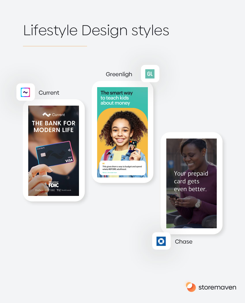
Only 16% of apps used this creative strategy which shows it’s not only a great hypothesis to test (“showcasing real people using the app or enjoying its benefits will drive more users to understand it’s accessible and trustable and install it”) but that it’s also an opportunity for differentiation as users compare different apps.
A good idea for when it’s worth experimenting with a lifestyle design style is when the marketing message revolves around a narrative of “we’re a product for humans.”
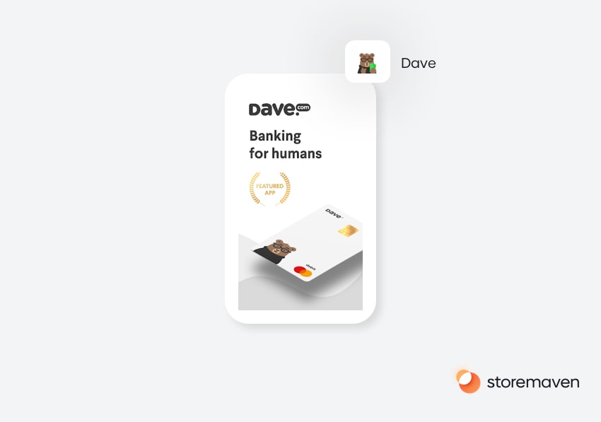
Dave is again the only app that really says it out loud. Dave is Banking for Humans. They actually use the word humans; you can’t connect with people any better than spelling it out like that. This means, as a proxy that banking is usually not for humans, this bolder messaging strategy again helps Dave differentiate itself from the pack. But if that’s the case, could an image of a real person convey that message better? It’s worth trying out.
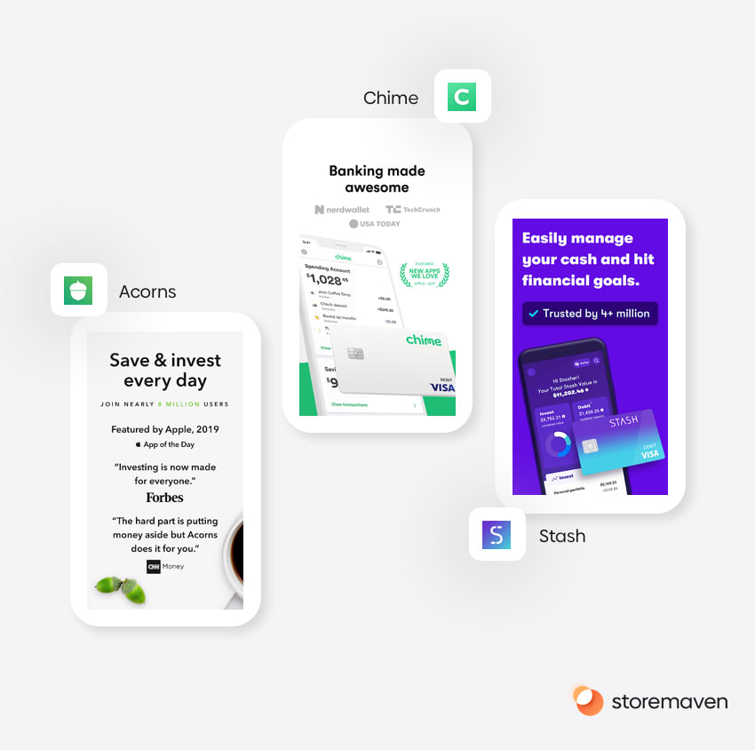
3. Social Proof
About 11% of apps in the Finance category are using social proof elements (e.g., best app of X awards, recommended by experts, etc.) within the first impression. This shows the theme of Finance in general that people need trust in order to decide to use a financial product.
The question is whether the best way to convey trust is through the number of users using the app? It might be worth testing the combination of this message with a lifestyle design trend, to make it more powerful.
4. Security
Lastly, very few apps are leading with a message around security (less than 6% of apps). Maybe it’s the elephant in the room that nobody wants to mention or just seeing the word ‘secure’ frightens users?
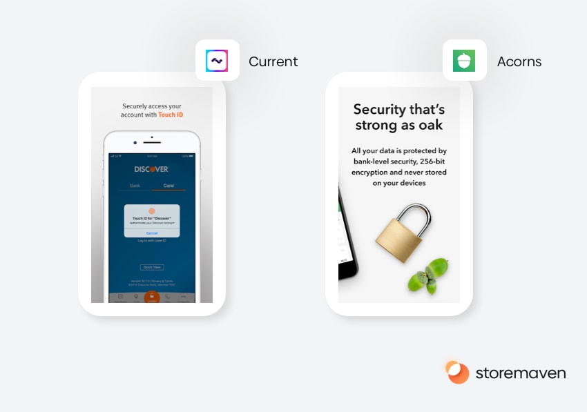
It’s worth noting that several apps are perceived as more sensitive than others (investment/trading apps, bank apps, money transfer apps). It seems that according to the current trend, this isn’t a prevalent message that the top apps lead with.
One approach that we’ve seen in the category is highlighting the Touch ID or Face ID features for secure access. Another approach is to speak directly about security without tying it to a specific feature (such as the right screenshot in the example above).
But the social proof message basically serves that purpose. By showing that several million people are using the app, users are able to understand the app is likely to secure and can be trusted.
Conclusion: Financial finale
So what are the main takeaways?
- Identify the convention (norm) in your category and try to break away from it in order to differentiate yourself from the pack. In the Finance category, Dave is the only app that’s trying to do that by using a character in its icon.
- Experiment with videos, and make sure you’re placing your strongest messages in the first 1-3 seconds. In the Finance category, only 13.3% of top Finance apps are using videos, which means that getting videos right could also have the added benefit of increasing your app store page’s ability to grab users’ attention (especially in Search Results where the video will autoplay).
- Audit your current messaging in the app store, how does it fit (or break the convention) of how the top finance apps are marketing themselves? Experiment with the different messages and evaluate which messaging strategy is working best for your specific audience. Also, experiment with using social proof elements, lifestyle design style. Make sure that you’re helping your users understand the ease of use and accessibility of your app, don’t use the UI to convey that idea if it’s not extremely simple and doesn’t serve that purpose.
- Change the design styles of all your assets and match them to how users make decisions in the app stores. If you’re using small UI elements and a small font-size for the screenshot caption or for your app store video, you’re decreasing the chances that users even stick around to “get” your message. It’s not only about the message; it’s about how you deliver it.
Yep, there’s a lot to chew over here, we’ve covered a lot of ground, and we’ve provided a ton of valuable insights that can be taken away and discussed further. Remember, the Finance apps industry is competitive, but companies are breaking away from convention to stand out in the crowd. And you could be one of them.
Thanks for joining, see ya next time on our next category analysis 🙂


