The goal of any ASO creative optimization strategy is simple: increase conversions. It would help if those conversions will be high quality and consistent but mostly just to get the most eyes on page and the most installs per set of eyes. And you can know what to say and how to say it and where to say it without the guesswork, by intelligently and systematically testing.
It’s all good and well knowing you should be testing but where do you start? There are what feels like a hundred individual elements, thousands of options and countless permutations and combinations to try.
Well it helps to start from the most impactful. And luckily for you we’ve run the numbers and can tell you definitively.
You start where everyone starts: your first meeting, your first welcome, your first impression.

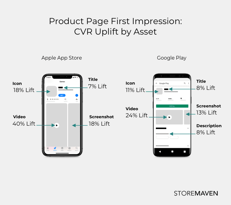
Depending on the platform there are many different assets that appear on the first impression and the key is to focus on the most important ones first; namely, video, icon, and screenshot gallery. Because remember, in the app stores as in life, you only have one chance to make a good first impression.
Video
Video is the single most powerful asset you have in your arsenal. This is because it is the most prominently featured asset on your product page and takes up the most real estate whether landscape or portrait. The mere presence of a video can have a major impact on user behavior increasing or decreasing the likelihood of further user exploration throughout the store. With video, you can pack the most punch into a single asset.
Apple has already fully rolled out autoplaying videos and Google recently announced they’ll be following suit. This means that all users will be exposed to more content more easily (in a single asset) without having to explore the store. The key is to make sure that your video speaks to a wide audience as it will be seen by the highest number of users. Before the advent of autoplay, the poster frame was the most important feature of your video (and would act as the first static screenshot before a user clicked the play button) but now your video needs to be optimized.
- Focus on the first 5 seconds. Most users drop off after that point so make sure you put your most high impact messaging at the front.
- Highlight specific value propositions and use video to convey an overall experience as it is a multi-sensory medium.
- Keep in mind your audience and target messaging to your highest quality users.
- Localize your video. Localization can help lift conversion rates by 26% and is more than just a language choice. It helps users connect to your message on a more personal level.
- Remember that most users will see your video without sound so make sure your imagery delivers a full experience and think of sound as an enhancement. Narration should be avoided for this reason.
Testing video is essential in understanding which messaging causes users to engage and which messages lead to higher drop offs. By testing for video you can monitor each frame and see data from the entire length of video and not merely a binary yes or no conversion question. You can optimize your video through each frame and each message to be able to garner insights about your audience and create the most appealing and enticing experience for your users that will make them want to install.
Icon
Even beyond autoplaying videos, icons are the one asset that is seen by 100% of users through 100% of user journeys. It even comes into play before a user enters the app store or your product page as it is used both within the stores themselves as well as through UA efforts. It is displayed in ads, search results, top charts and feature placements. The icon holds pride of place on your product page. In certain instances it can be the only asset a user will see and could be enough to convert. Think of branded search for example, a user will search your brand name and look immediately to your icon in the results in order to verify if they have found the right app and upon confirmation are likely to install directly from the search results.
- Make sure that brand recognition within your icon is never compromised whilst still playing with different options.
- Use core characters and/or brand logos to make your icon instantly recognizable.
- Highlight feature updates with banner placements.
- Keep your icon fresh with updated seasonality motifs and backgrounds.
The strength of your icon is tied to the recognition of your brand so testing is vital to make sure that any icon updates don’t dilute this. Whilst playing around too much with your icon might pose a risk, testing will enable you to make the most of this asset and attract both new and lapsed users. There is much to talk about with this seemingly staid asset so we wrote a whole piece dedicated to it.
Screenshots
Next to video, screenshots are the most valuable asset you have with which to convey multiple messages and feature prominently on multiple user journeys, such as search results.
Depending on the orientation you choose, whether or not you have video, and the device of your user, one to four screenshots may be shown. It is for this reason that you should think of your screenshot gallery as a story and each screenshot as a chapter.
If users only read the first chapter, what would you say? If they read further, how can you add to the story to make it more compelling?
- Build your screenshots from the most valuable proposition outwards.
- Test out different design styles to see which engages your users best.
- Different orientations have different abilities to convey messaging and different legibilities. See which works best for what you want to communicate.
- Create a coherent and compelling narrative for users to follow through the gallery.


There are so many options for how to set up your screenshots that the only effective way to know which direction to go in is to test them. And keep testing. If the endless options are making you dizzy, try having a skizz at our comprehensive guide to screenshot testing.
The Testing Cycle
Once you know what you want to test, you need to make sure it’ll be a valuable one, one where you’ll be able to draw actionable insights. The process is simple, and perfectly circular, allowing you to build on your knowledge with every test.

To build hypothesis of value, always start with great research. From industry benchmarks and competitor reports to design and messaging trends, once you know what the landscape looks like you’ll be better able to build hypothesis that will add value. Everything boils down to your hypotheses and that’s why after each test, your analysis should leave you with deeper questions to answer allowing you to repeat the process but this time on a better, more knowledgeable base level.
Once you nail the iteration cycle, you have a plan that will last you your entire app’s lifetime, building on core knowledge, understanding your users on an ever deeper level, improving hypotheses and continuously discovering the best possible combination of the best possible assets at the best possible time to show them.
Optimization is a continuous cycle. Once you get on the testing carousel, you stay on the carousel: testing and implementing and iterating and learning. So take a deep breath, arm yourself with research and jump straight on.


