Last year there were plenty of mutterings about how and what the effect of the Google Play redesign would be. Well, it’s been 248 days since it came into play and we want to turn those mutterings into (semi-)conclusive statements about the behavioral changes of users since then.
When the announcements were first made we constructed a test series to see what we could expect from the changes. We took existing creatives that were optimized for the old store and put them into the new layout and tested user responses. The time has come to evaluate those predictions and see what actually played out. Were we right? And if we weren’t, well, what actually happened and what insights can we glean from it?
SPOILER ALERT: We did, indeed, get some things wrong.
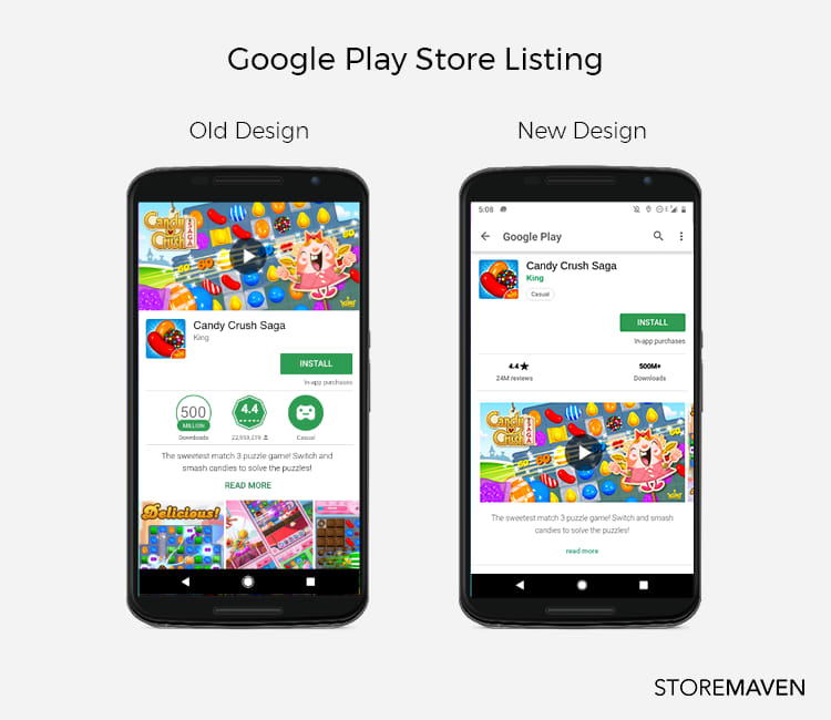
As a recap for those who are so used to the current design they almost forgot what it looked like before, here’s what happened:

The biggest changes were the removal of the feature graphic, the video moved into the gallery as the first screenshot, and the gallery as a whole moved fully above the fold and into prime real estate. Other things also happened but these were the most significant, both visually and effectively.
Back in October, we predicted the following:
- There would be an increased explore rate across the board, likely in the region of 30-50%.
- There would be an increase in the rate of gallery scroll, around 3-6 times the previous rate.
- In the case of a video, the new placement would bring about a 60% increase in video watching.
- But, this video would also likely decrease the rate of gallery scroll by as much as 51%.
Predictions are great but solid data is better, so, let’s take a look at the numbers. After evaluating data from 28 million individual users participating in 729 tests for 272 different apps across verticals and industries, we think we finally have a large enough sample with which to accurately compare the impact of the redesign on user behavior.
But why would user behavior change?
The short answer: packaging matters.
The basic reason for why we know users will behave differently is that they’re being fed different information; a different narrative, a different story, and a different set of data from which to base their decision. Obviously, this will affect what they do. The better question though is how.
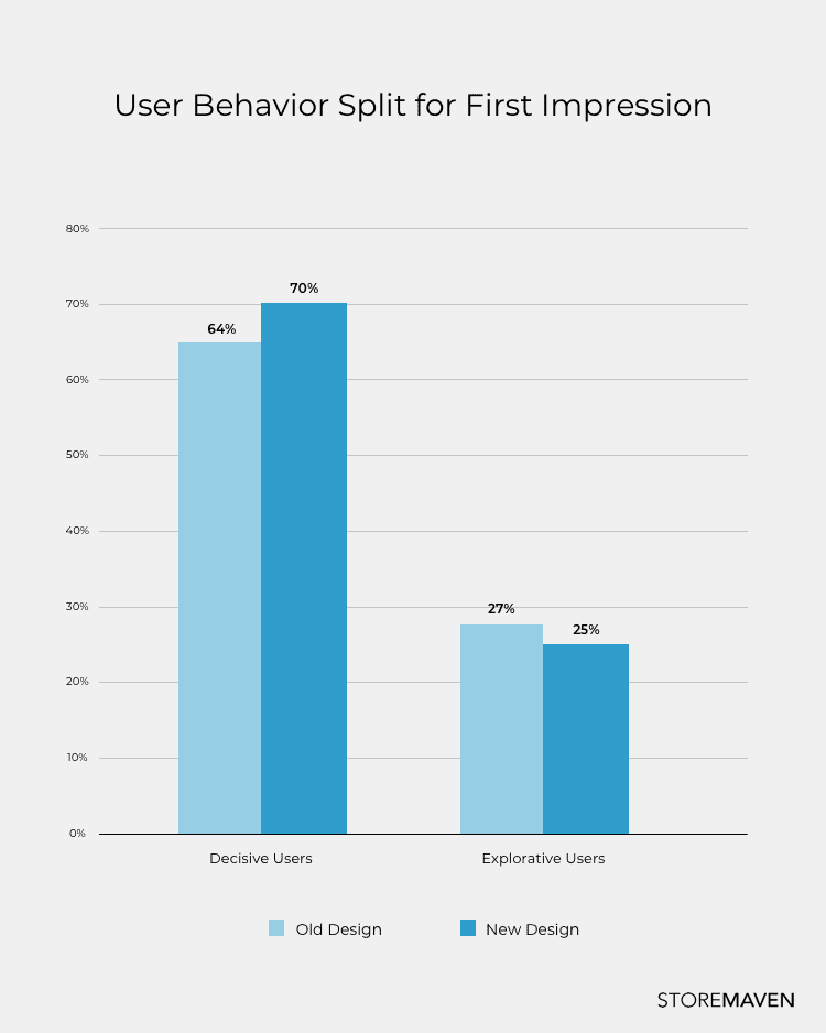
Let’s start with the most basic action of users, one that makes the distinction of users being decisive or explorative. Upon seeing the First Impression, are users ready to make a choice or do they need more information?

It is clear decisiveness has increased. More users now believe that they have enough information with which to make an informed decision. And they do. They choose to install immediately (at a 112% higher rate than before). If you’re paying attention that means Prediction 1 was wrong, but why?
It all lies in the significance of the First Impression. That front page above-the-fold newspaper headline story (what sold papers back in the day) is the same as what sells apps today. Intriguing and relevant information needs to be given top priority. With the new design, the First Impression now holds more information so the ability to convert increases. Whether it does (or doesn’t) depends on how well optimized and constructed the creative assets are.
So what happened to the explorers?
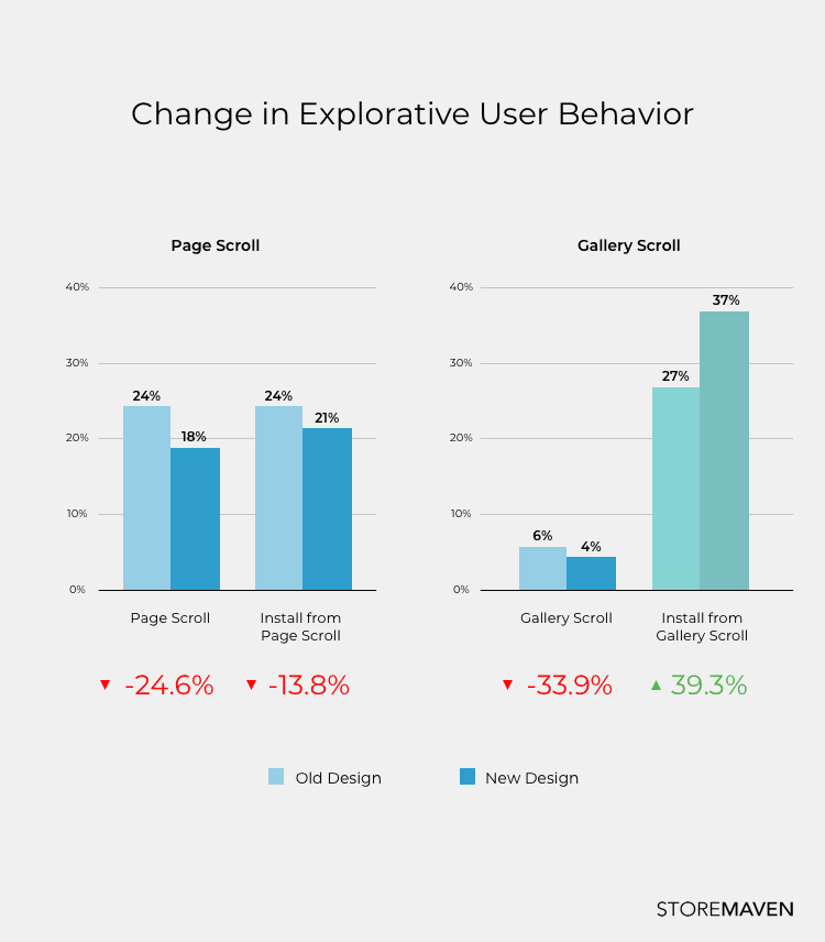
Because decisiveness has increased significantly, it makes sense that the act of scrolling through the gallery (or any other act of exploration beyond the First Impression) would decrease too. And that’s exactly what the data showed. But more interestingly, our initial tests had predicted that gallery scroll rates would increase significantly. This was not the case. In fact, gallery scrolls decreased by 33% but (and it’s a big but!) of those who scrolled the gallery, more users across the board for both games and apps were inclined to install after viewing the gallery. This means that the screenshot gallery still has an important ability to convert, even if fewer users actually see it all.

Our third and fourth predictions were around the effect of moving the video out of the feature graphic space and into the gallery as the first screenshot. The idea was that this would increase video watching (even without autoplay which doesn’t exist in Google Play) and decrease the rate of gallery scroll.
Pages without video had a minimal decrease in gallery scroll rates (from 6.1% to 5.7%) and increased gallery conversions. On the other hand, store pages that did have video experienced greater overall conversion rates compared to those without video (a 31% increase compared to a 13% increase). And that’s when things get interesting.
The existence of video as part of the gallery did not increase video watch rates (they’re still low, still hovering around 6% as before the design change) and even lowered CVRs for those that did watch the video by 21.4%. But when comparing CVRs of stores that used video versus stores that didn’t, stores with video had higher CVR overall. It appears that the mere existence of a video increases conversions even if the video was not watched.
It is interesting to note that page scrolls decreased across the board but gallery scrolls increased for store pages without video. Users seem more comfortable exploring left-right than they are scrolling down the page and developers should take advantage of that. It also means that if you can’t convert through the First Impression and the gallery, chances are those exploring users won’t find what they’re looking for and are likely to drop.
Why did predictions differ from results and what does this show?
It’s simple: active optimization changes everything. Smart developers know that optimization is context specific and the same assets in the old design would not work the same way in the new one.
The reason the impact of the redesign was so greatly felt was due to the entire reshuffle of what appears on the First Impression. It now allows for so much more information to be conveyed in just a single frame. The front page of the newspaper tells you enough of what you need to know to purchase the paper. On the flipside, if you struggle to convert users in the First Impression, it’s an uphill battle to convince them later on. If you need more information, chances are the users might never get enough to convert.
Because users are now more decisive than before, it’s even harder to know exactly what works and what doesn’t work on an individual asset basis. The only information you get from decisive users is an opinion on the sum total of your creative assets. Our original predictions were based on initial tests using creatives that were unoptimized for the new layout. The fact that these predictions were wrong further proves the importance of optimization and the need for continuous creative asset testing. The task now is to nail down user behavior so you can nail down your creative assets. And the only way to do this is by running systematic segmented tests to understand the specific user behavior that drives installs.
With the new design marketers now have a clear roadmap to improve and that’s a win for everyone. Optimize the First Impression. Optimize each element on the First Impression, optimize the gallery, and optimize how they communicate together.
Remember: how you lay out your messaging impacts the reception. Your First Impression is often your only impression. Make sure it speaks as a whole.


