Over the last few months, Google has been testing a redesign of the Play Store App Listings. The redesign holds interesting and significant opportunities for developers.
Although there is still so much uncertainty as to when the new design will roll out, when it does, it will unarguably force developers to rethink their App Store Optimization (ASO) strategy.
To understand the implications on ASO, we ran Play Store Listing tests with several leading mobile app developers. We tested identical marketing assets in both the current and new layouts, and in a majority of tests, the winning variations were different for each layout. This proves that what works in the current Google Play design won’t necessarily be successful in the new design.
Here are our biggest findings…
Google Play Redesign Gives Gallery Assets More Prominence with Implications on CVR
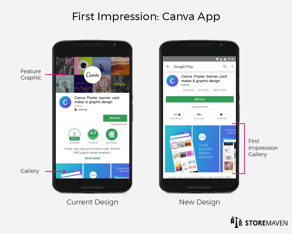
Compared to the current Google Play design, the new layout caused a CVR decrease of about 15%. In the current design, the most dominant creative asset is the Feature Graphic displayed at the top of the Play Store Listing. This is the asset that most developers rely on to convey their strongest messaging and encourage installs.
With the new design, however, the Feature Graphic has been removed, and the Gallery is more prominent in the First Impression Frame. The decline in CVR is driven mostly by the fact that developers have been too reliant on the Feature Graphic and therefore neglected the images they showcase in the Gallery.

Since this update hasn’t yet been released, developers have the fortunate opportunity to optimize the creative assets in their Gallery before it goes live. It’s crucial that Screenshots and Videos in the Gallery are tested to ensure they effectively showcase apps’ unique selling propositions and encourage installs. In fact, our data has shown that testing your Screenshots can increase CVR by up to 28%. For tips on designing Screenshots that drive more installs, refer to this.
Google Play Redesign Increases Visitor Engagement
We found that there is actually an 83% increase in visitor exploration with the new design. For comparison, the exploration rate of the current design is 17% compared to almost 33% in the new version. We expect that some of the exploration is due to visitors getting intrigued by a fresh, new layout that they’re not accustomed to seeing. In any case, this is a good opportunity to leverage the curiosity surrounding the new layout to communicate aspects of your app that visitors haven’t seen before.

We also found that the layout itself, which showcases the Gallery to visitors as soon as they land on the page, encourages engagement and makes exploration more intuitive than the current design.
With this increase in engagement also comes an increase in Gallery scroll of over 6 times the original Gallery scroll rate. In the current version, visitors needed to be intrigued enough by the Feature Graphic to scroll down to see the Gallery, and then continue to scroll through the rest of the Screenshots. Only 2.2% of visitors currently complete that action compared to 13.9% of visitors who scrolled through the Gallery of the new layout.

In the Canva example above, the main messages and captions in the Gallery of the current design are hidden because the Feature Graphic pushes the creatives almost entirely below the fold. In the redesign, the First Impression Gallery is completely visible, and its engaging, colorful design encourages visitors to keep scrolling and learn more.
Google Play Redesign Offers New Opportunity to Leverage Ratings & Reviews
The new design also creates an opportunity for the Ratings and Reviews Section to be included above the fold in the First Impression Frame. This allows developers to leverage social proof to encourage more installs. Based on our data, the visibility of ratings can increase CVR by up to 12%. However, it can also negatively affect visitors’ perception of your app if ratings are low or negative.
Developers can choose whether they want to include this section in the First Impression Frame by simply changing their Gallery orientation.

In order to have the Ratings and Reviews appear in the First Impression Frame, you must have at least one Screenshot in landscape orientation. Portrait Screenshots will automatically resize so their height matches that of the landscape Screenshot in your Gallery, bringing the Ratings and Reviews above the fold. To keep the Ratings and Reviews Section below the fold, your Gallery should only contain portrait Screenshots / Videos.
It’s important to test different Screenshot orientations with this new layout to truly understand how showcasing your app’s Ratings and Reviews influences the install behavior of your app store visitors.
Although Google is still testing the redesign and hasn’t yet confirmed a release date, it’s clear from our analyses that accepting the new layout without adjusting your creatives or ASO strategy may have a harmful impact on your app’s growth.
If you’d like to stay ahead of this change and ensure your app is optimized for the new design, feel free to reach out to us at [email protected].


