It’s one of the most pleasing outcomes any App Store Optimization (ASO) marketer can expect: creating app store pages that are suddenly talked about and people look for. And, as all marketers, we try to find inspiration around us, a spark that will ignite our imagination, that we can then build on with our own ideas and creativity.
“Good artists copy, but great artists steal.”
Pablo Picasso
This quote was later used during some memorable on-stage performances by Steve Jobs. The meaning here is that taking great ideas from people who did it before is acceptable—it’s how it’s done. The trick is making it your own, pulling inspiration from multiple sources, adapting them to your style, and reflecting them in your work. Without being too philosophical, nothing is really original, isn’t it? In this article, we hope you’ll find inspiration from some great apps and games of companies and developers who are doing it right.
Definition of perfect app store pages
First things first. What is the perfect app store page? Is it the top-ranked one? The best converting one? What do we look for when scanning that page for inspiration?
The answer here is tricky, but it’s this line of thinking that should guide you through this text. You need to tell your own story. Some pages will look, feel, or do something that will be mind-blowing, but it won’t serve your goal. So first, determine that you’ve got these questions covered: what’s your industry? What’s your category? What purpose does your app or game fill? Who are your competitors? And, especially, who is your audience, your end-user?
With this in mind, you can now move forward and examine each and every component of your page: whether it’s the video, screenshots, title, or description. Look at your first impression— everything that goes above the fold on your product page—and see how it conveys your story and your goal. And don’t forget to always test new ideas to understand their impact, taking into consideration the differences between the two app stores and the people who are visiting both. Let’s dive in.
#1: Square Point of Sale – taking testing to another level
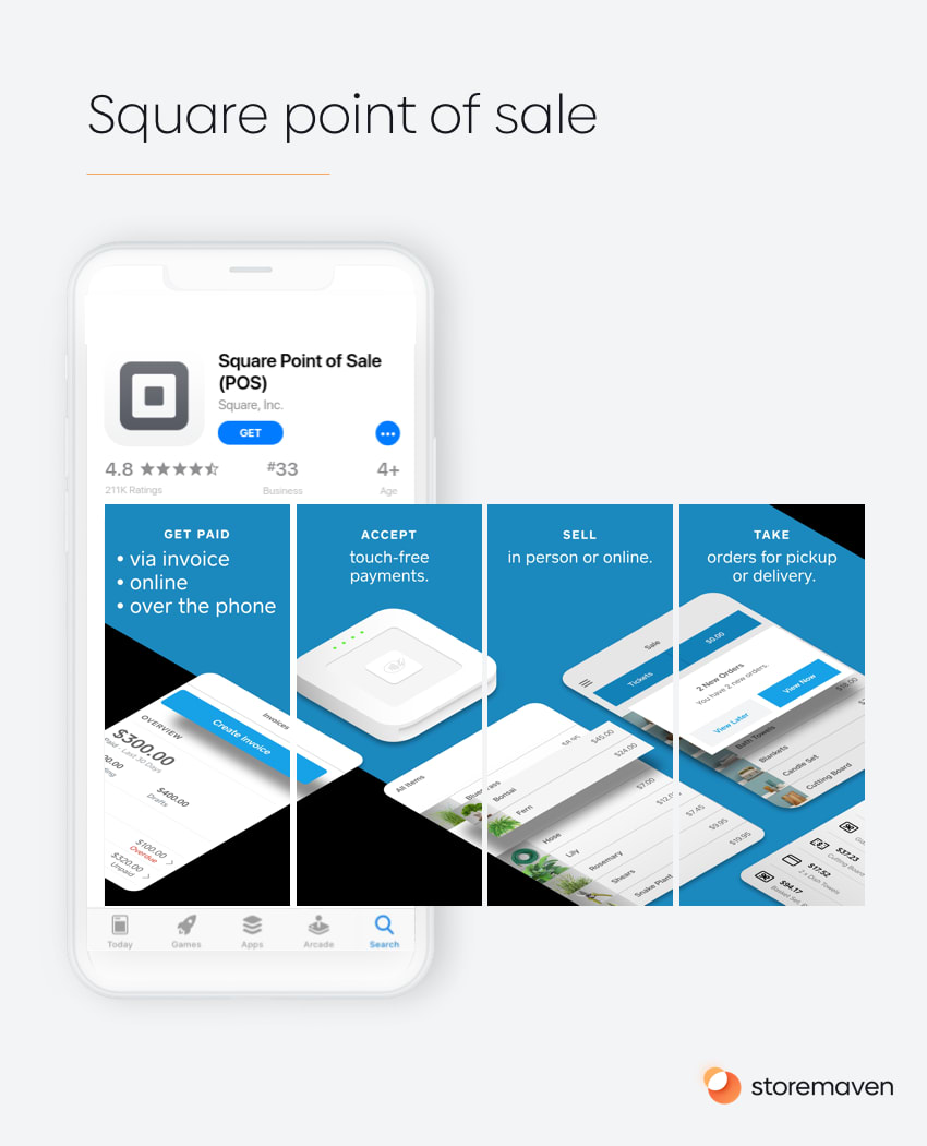
Square’s Point of Sale app is an example of a B2B app that followed a specific testing progression to create that specific page. Square’s teams understood that, through testing, users preferred a video that opened with the messaging, “Accept all types of payments” (which embodies its main value proposition) and then was followed by, “the app to run and grow any business” (which points to the conceptual goal of the app).
For Square Point of Sale potential users, after testing various value propositions, it was the “accept all payments” message that worked best and aligned with what small business owners actually want to accomplish or what they value most about a payment service.
The design style was set after Square conducted two rounds of screenshot design tests. They came to the conclusion that users respond best to a page that aligns with Square’s brand (as its brand is quite strong), but with a refreshed look.
#2: Grab – a portfolio of services
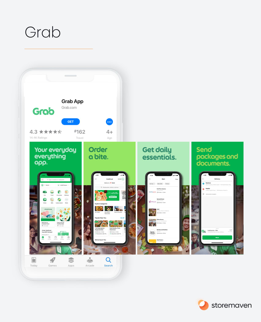
The ride-hailing, food delivery, and cashless payment app Grab, from southeast Asia, uses an interesting landscape screenshot on Google Play. It features a large caption that illustrates the app’s overarching mission, the brand, the phone UI, and a real-life view of the user experience all in one shot that doesn’t look too crowded.
With many different offerings, Grab showcases each of their important traits separately—in bold letters and short words—in a way that ensures everyone can find one benefit most relevant to them. Grab understands that there are many uses for their app, and they need to separate and test their different services to see which one their audience responds to most optimally.
The clear style, unusual font, and unorthodox color palette form a unique, holistic look that is hard to achieve, especially when mixing themes such as lifestyle and feature-oriented.
#3: Marvel Contest of Champions – making the most of your video
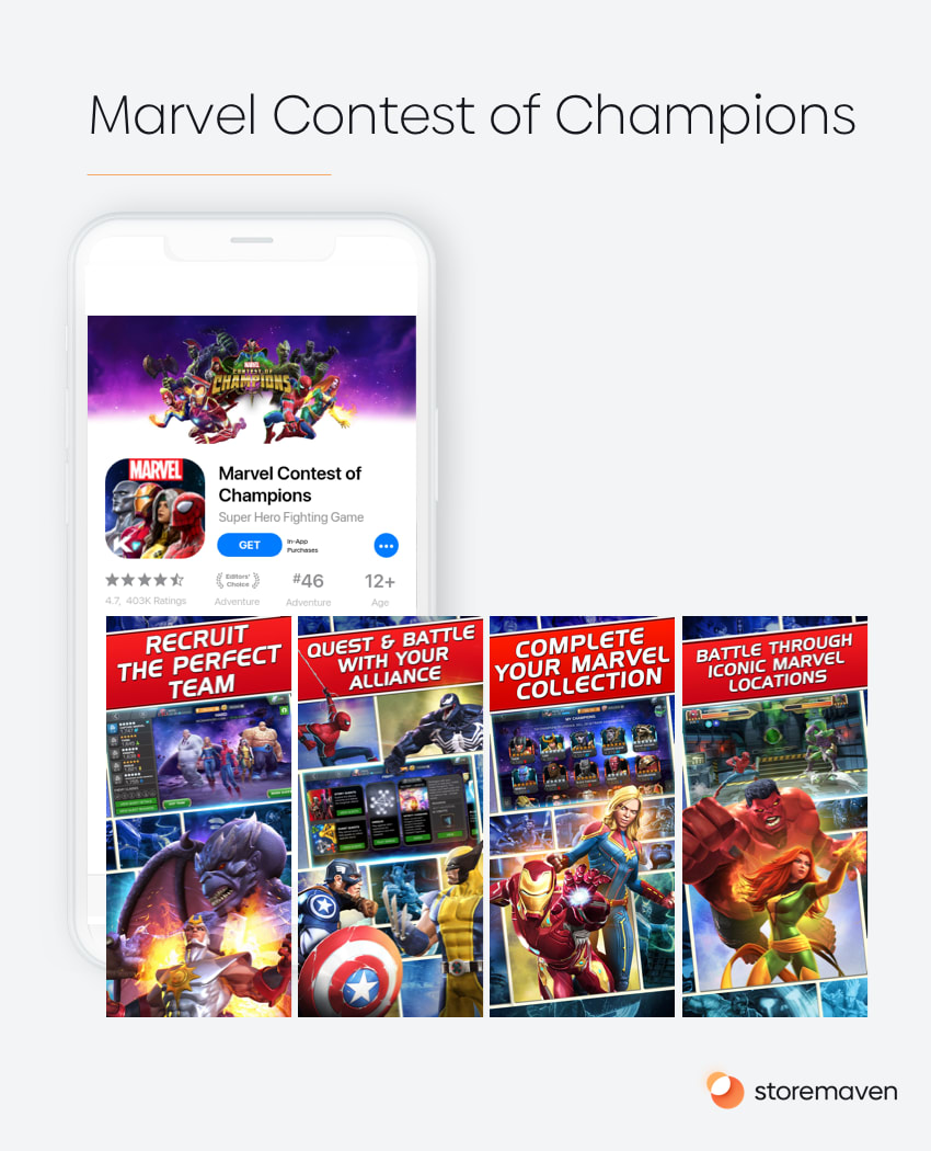
Kabam’s Marvel Contest of Champions page shows a unique way that developers can innovate with video. This has been out for a while, but not a lot of developers seem to be aware of it. It may look a bit crowded at first glance but manages to do so much in the limited space available, maintaining the comic-esque vibe.
The video itself is a good example of what to use and what to avoid when creating a video. The concepts of short clips, different game scenarios, and no brand mentioning or captions to interrupt the user experience are very well exemplified in the video. The choice to make a 15-second video instead of using 30 as most do, is another well-thought decision.
Although companies can probably save some money or production time this way, it also reflects well the high-pace tempo of this battle mode game. Remember that users make decisions extremely fast and they won’t consume all of the videos. The main reason this video worked is that it’s able to convey multiple strong Unique Selling Points (USPs) to almost the entire traffic that comes onto the page.
#4: Google Maps – mastering lifestyle
Google Maps’ ASO strategy does two things right.
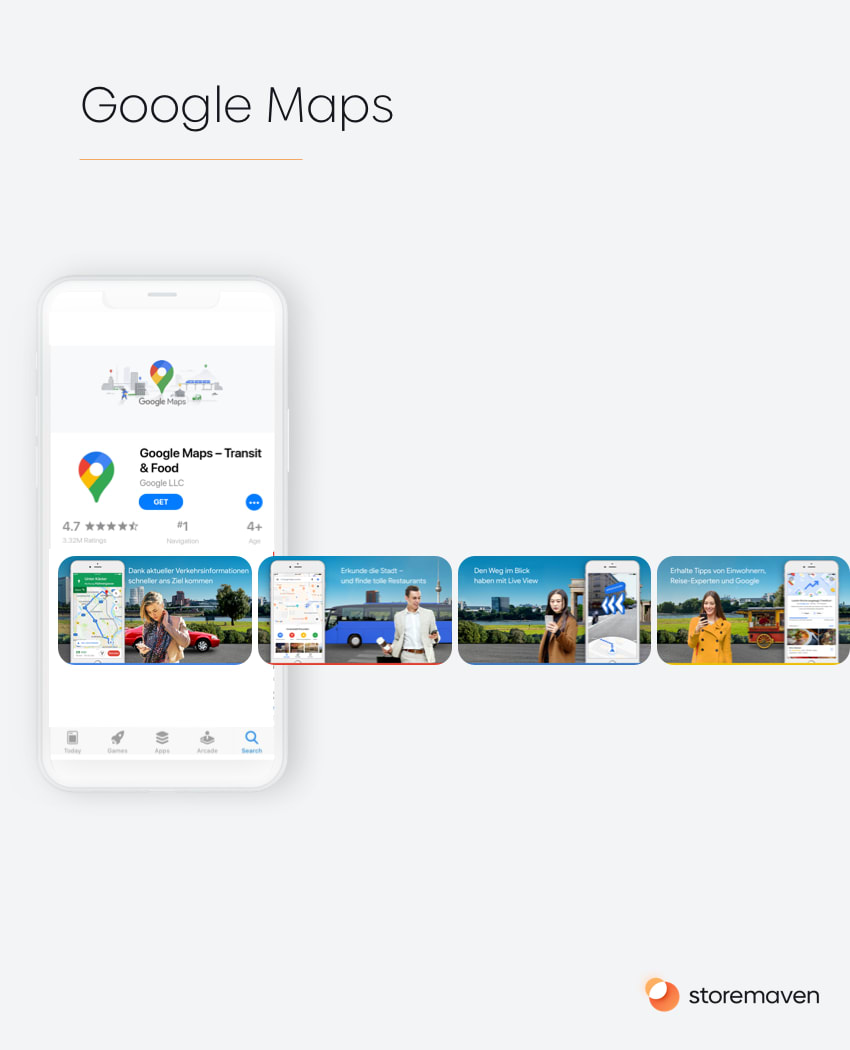
First, it tackles localization very well. In different countries that Google Maps prioritizes, Google changed the screenshots to showcase local maps, local people, recognizable scenery (as in the example below showing Berlin landmarks), and translated captions.
In an app such as Google Maps, this helps convey to users that the service will work well in their country, a concern some might have with map apps. Secondly, Google uses a design style we call “lifestyle” in a very clever way, showing people using the app on the go. Other than allowing them to convey the local aspect of the app through local people and scenery, it helps users connect in a more emotional way to the most important use-case of the app—using it while you’re on the go and need to get somewhere fast or find a recommendation.
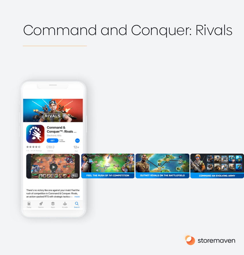
#5: Command & Conquer™: Rivals – combining gameplay, characters, and art
In this example, Electronic Arts (EA) combines three design elements to hammer down the most important and effective messages for this type of game.
Command & Conquer Rivals is a result of a brilliant strategy of using an “old” and well-known Intellectual Property (IP)—the original Command & Conquer PC strategy game. Rivals brings back to life a game that was loved by millions in the ’90s and adjusts it to their current habits (now that they’re in their 30’s-40’s and probably have less free time) with a short Player vs Player style experience.
Tailoring their messages to that existing fan base, EA knew they needed to tackle a few things:
- The art—showing art that conveyed the feeling of the original game world that people love.
- The gameplay—showing that this is a game that can be experienced at an extremely fast pace with short PvP sessions.
- The characters—wisely using well-known characters throughout their app store assets to lure in the original fan base that was emotionally connected to these characters evokes a feeling of nostalgia.
They managed to hit all three points with an extremely effective video that combines all elements designed in an optimal way (fast-paced, divided into short chapters, each covering a different game proposition) with a fantastic gallery that is a hybrid between showcasing the characters and gameplay.
Summary
These five examples are just the tip of the iceberg, to say the least. Yes, there many things you can take from each one and see what fits your app or game, but there’s a more comprehensive strategy around them all you should embrace.
All the above examples demonstrate how to put data to good use for better user experience. When these two aspects are front and center—with quite a bit of trial and error (because there are no shortcuts)—you will achieve success more often than not.


