As an ASO person, you are trusted with one of the most important strategic assets for your company, your App Store Product Page. And with this responsibility, you hold the key for amplifying the entire company’s growth by increasing conversion rates in the App Store, for paid and organic traffic.
All user journeys – tapping on a paid ad, searching for an app in the app stores, or casually browsing the top charts and curated lists in the app store – fall into these categories, making every element on your App Store Product Page crucial in driving installs to your mobile app.
First things first – what are product pages, and why are they so important?
The App Store Product Page is in fact your landing page within the App Store, your only distribution channel for your iOS app. This landing page consists of a set of elements that are under your control, such as the title and subtitle, screenshots, videos, and descriptions. There are also elements beyond your control such as limited layout options and reviews (to some extent).
Remember: The role of the Product Page is to showcase your app’s core value and to drive users that care about your service to download and use your app instead of your competitors.
This is why the practice of creative optimization in the app stores evolved within ASO. Success here equals an increased conversion rate with your most valuable users. It means amplifying all marketing efforts that are happening in your company be it influencer campaigns, paid ad campaigns, offline marketing, brand awareness campaigns, and more.
Failing in getting creative optimization right means that every such effort will be significantly less efficient and every team will need to work much harder to drive installs. You’ll be putting a ton of effort into driving users to see your App Store Product Page, but too many of them will drop out of the page without ever installing as they won’t be sold on your app.
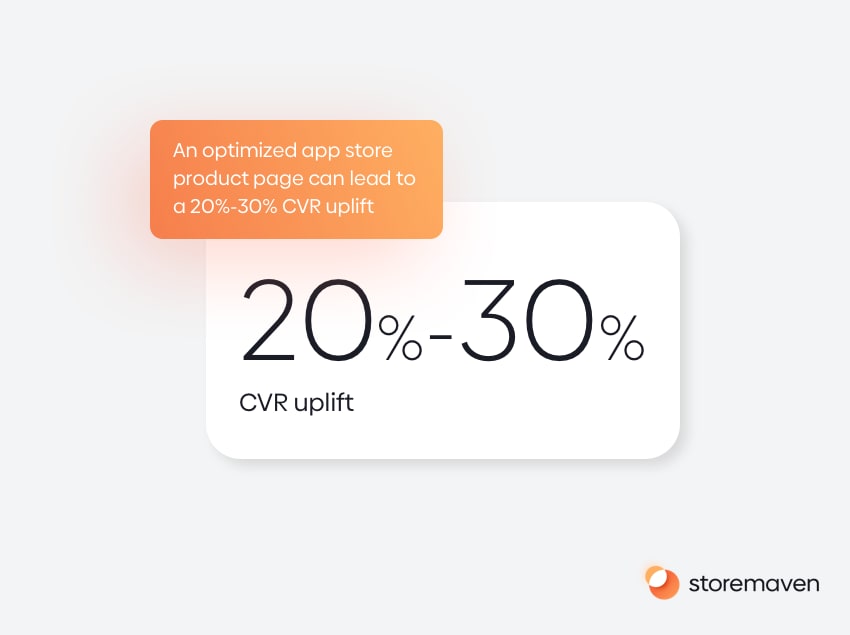
And It’s not just about conversion rates
Without taking from the importance of getting growth directly by increasing conversion rates, doing so will result in several indirect positive effects. Many of the top mobile brands that dominate their categories are leveraging this relationship to drive more growth.
- Better conversion rates lead to better ranking as both the App Store and Google Play publicly discussed that they take into account “user behavior” (Apple) and “Store Listing Performance” (Google) when calculating keyword ranking. A better conversion rate will lead to a higher ranking.
- The other side of this coin is that by improving conversion rates for new audiences that are installing your app for the first time, you are increasing the volume of first time installs in the App Store (App Units). Doing so will signal to the platforms that your app is relevant and you’ll climb in the charts that are affected by new install volumes to a great extent.
- Being able to acquire users at a lower cost is also crucial. Your competitors and your UA teams are competing for the same audience in most cases. If you, as an ASO person, are able to provide the UA team with a page that better converts paid traffic, they’ll be able to enjoy a lower cost per install (CPI) and better Return on ad Spend (ROAS) and have a competitive advantage against competitors when trying to bid for the same audience.
Everything you need to know about the App Store product page (iOS 14 in 2020)
App Store Page breakdown
Let’s break what an app store page is made of.
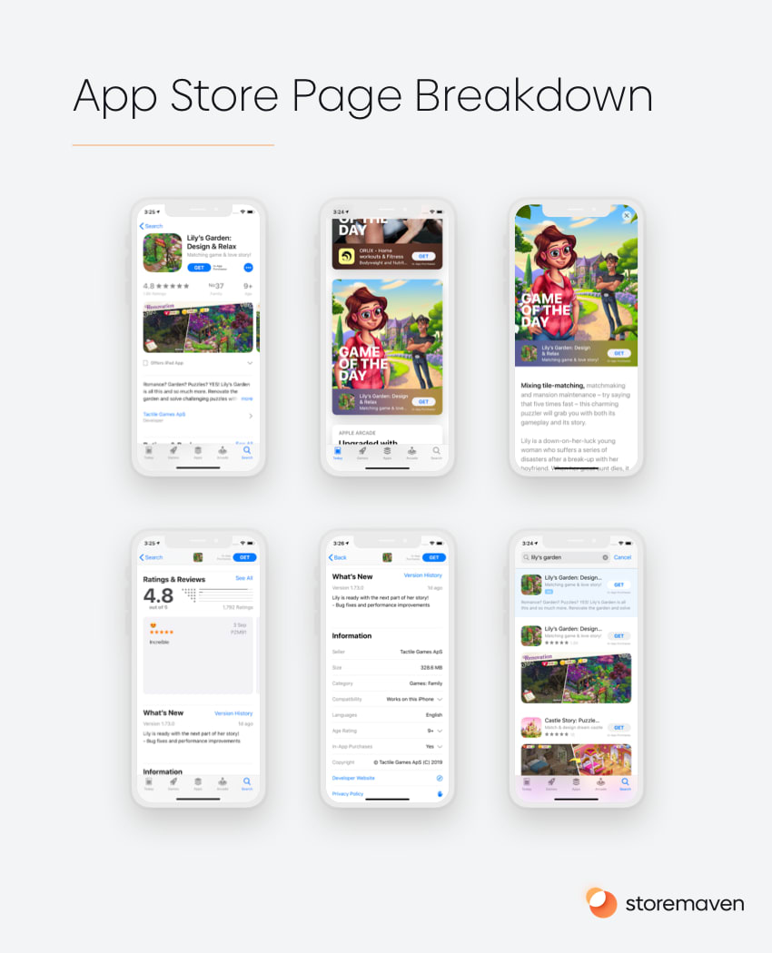
- Icon – your app icon, that is visible in the first impression as well as in any place in the App Store that’ll show your app (search results page, top/category charts, and featuring placements). The app icon should convey the essence of your app.
- Title – your app title that will also appear in all app store placements.
- Subtitle – a short text string that’ll appear below your app title, in the app store these strings change automatically from the developer’s name to the subtitle you chose in 3 seconds. By tapping on it, a user can switch it back to the developer’s name.
- Information panel – a scrollable bar that shows users:
- The star ratings the app received
- The number of ratings it received
- The age rating of the app
- The top chart rating for the app
- The developer name and logo
- The app language
- The app size in megabytes
- App Preview Videos – an optional 1-3 app preview videos that autoplay when users land on your app store page. The videos will always take up the 1-3 first slots of the screenshot gallery.
- Screenshot gallery – a gallery of up to 10 screenshots a user can view by scrolling horizontally. The gallery can be either in a portrait orientation or in landscape orientation.
- Description – up to 4,000 characters describing your app and why should users install it. The description is only visible for users that tap on the read more button. The first few lines of the description are visible (approx. 40-50 words per line) without the need to click the read more button.
- Ratings & Reviews widget – a widget that shows the star ratings, number of reviews as well as individual reviews in a scrollable gallery. Users can tap to open an expanded view of the ratings and reviews and filter between different types of reviews (most helpful or most critical)
- What’s new – a section showing the developer notes from the most recent version release.
- Additional Information – a panel that shows more information about the developer such as compatibility and the privacy policy.
- More by the developer – a section that shows all apps from the same developer, a user can tap to see all apps in an expanded view.
- You might also like section – a scrollable widget that shows apps that the user might like based on various personalization factors created by the store and a personalization algorithm that surfaces to the user apps they’ll likely want to install. Users can tap to open an expanded list of all the apps they might like.
What are the possible App Store Page Layouts
As an ASO person, you can choose a few different layouts for your app. It’s important to know how your app store page will look like in different layouts and for different users.
Portrait vs. Landscape Screenshot Gallery
The first, most important choice you have is to choose whether your app store product page’s screenshot gallery should be in a portrait orientation or a landscape one.
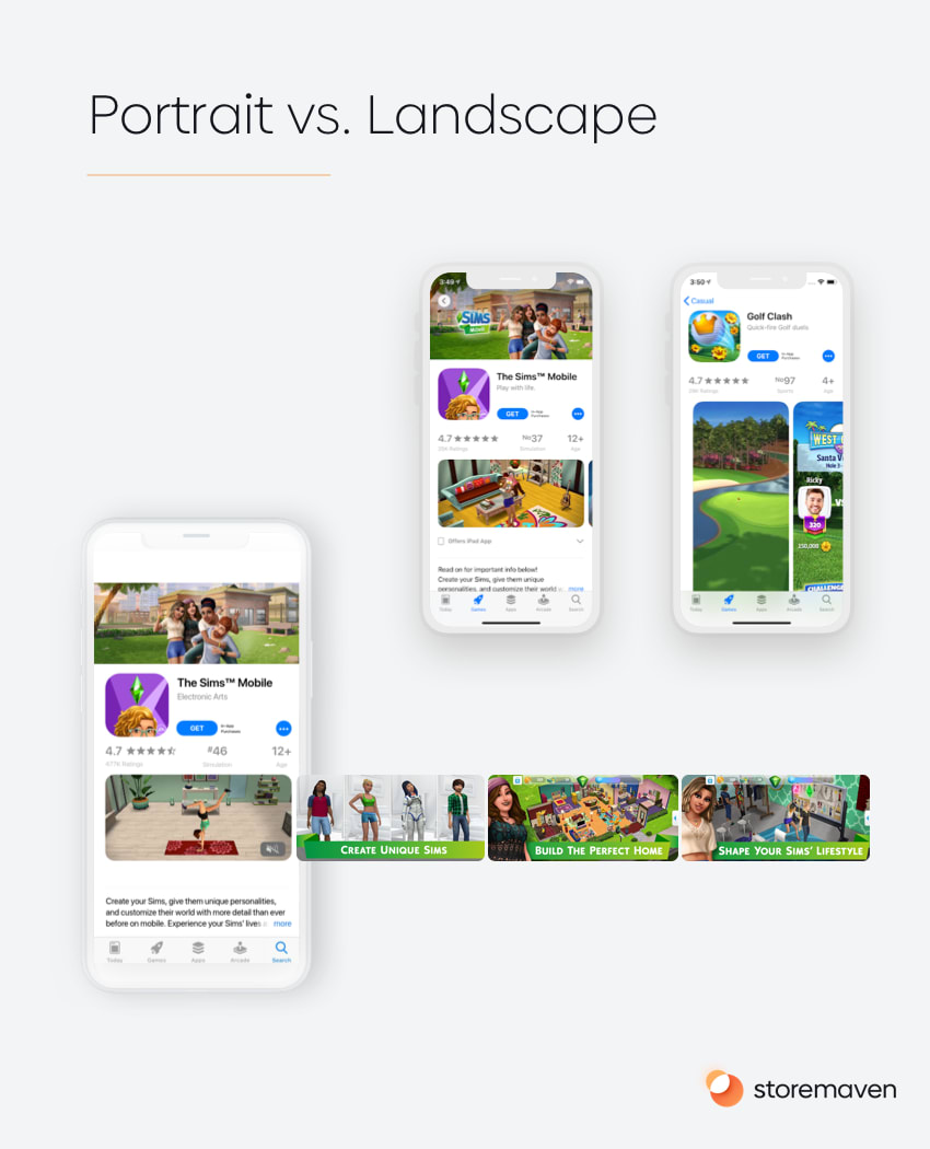
This choice has a significant effect on the way users behave in the app store and the way they’ll interact with your app store page. In fact, our tests with leading mobile developers have shown that an optimized gallery on the Apple App Store can boost conversion rate (CVR) by up to 40%.
In the Apple App Store, we’ve found that 95% of the top apps utilize Portrait Galleries. For games, there’s a little more diversity, with 63% of the top games utilizing Landscape Galleries.
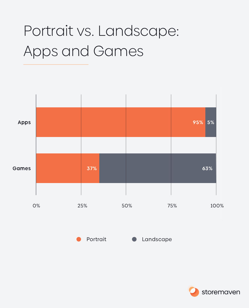
Based on these findings, it’s clear that developers of non-game apps are more inclined to use Portrait Galleries. This makes sense since most apps don’t support horizontal UI, and when App Store visitors search in non-game categories, they expect to see an accurate depiction of how the apps function.
Apps are also more reliant on showcasing multiple features in order to garner installs, which (as you’ll learn below) is more effectively done in a Portrait Gallery. However, this opens up the opportunity for apps that do support a horizontal view (e.g., entertainment, sports, or education apps) to differentiate themselves and utilize a Landscape Gallery.
App Preview Video vs. No Video
Another important choice you have is whether to use an app preview video or not.
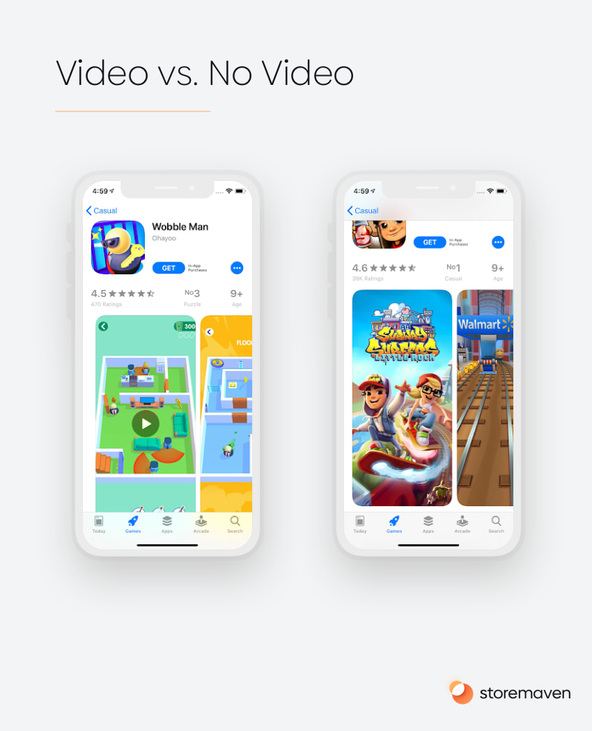
On one hand, it gives you the opportunity to convey more messages to 100% of your users in the first impression, but if not done right it can push users away.
Based on our data, we see that the uplift – the percentage increase in the downloads of an app – is about 35% and that users who watch the video are up to 3 times more likely to install the app. There are clear benefits to creating and utilizing video content.
But, there’s a but.
That’s the case only when a video is done right. For more on how to create the best video possible, check out this article.
A Closer Look Video
If you upload a landscape video and a portrait screenshot gallery, your App Store page will automatically include a new section called A Closer Look with the landscape video appearing below it.
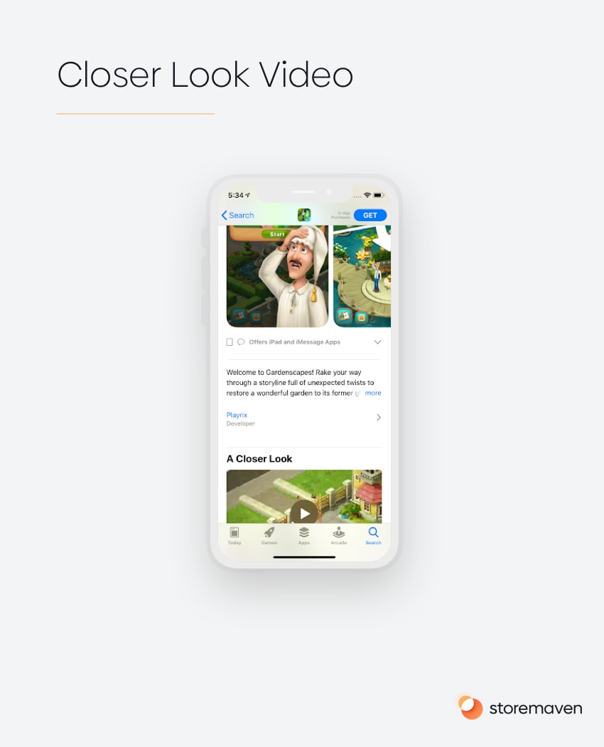
One of the cool things about the closer look section and video is that it’ll appear above the fold, and above the screenshot gallery for returning users that previously had your app installed which gives you a unique opportunity to use it for messaging optimized for this lapsed user. New users need to scroll the page to get to this section so only a relatively small portion of them (about 15%-20%) will see it.
Returning users (previously installed)
For these users, their first impression is quite different than what it is for new users. When users that previously had your app installed reach your product page they’ll see the What’s New section at the top, and below it A closer look video if one exists, and if not, the screenshot gallery which they’ll need to scroll to see it in full.
This puts more importance of the What’s New section which seems less important when thinking about new users, but for returning one it’s the one asset 100% of them will see, which means using the developer notes to convey to these users new and exciting things about the app/game will be key to excite them and eventually convert them.
How users interact with app store pages
Based on our research into more than 500M users and the way they interact with App Store pages, we found some interesting points worth mentioning here, that you should take under account when designing your page;
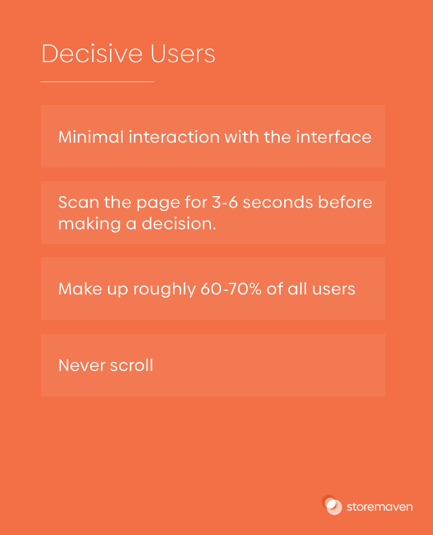
- Roughly 60%-70% of users spend 3-6 seconds without exploring anything besides the first impression before they decide to install or drop.
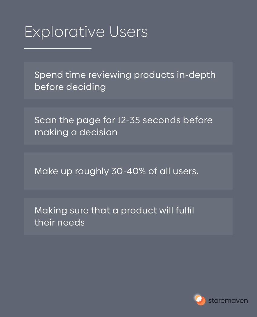
- The other 30%-40% of users spend 6-12 seconds exploring an app store page beyond the first impression before they decide to install or drop.
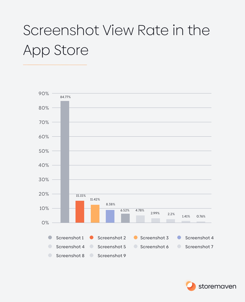
- Only 6.5% of users will reach the 5th screenshot, and less than 1% of users will watch the 10th screenshot. However, almost 85% of users will view your first screenshot. Check the graph below.
- Users in the App Store don’t like to read, only 2% of users tap to open the full description.
- The average video watch time is 5.8 seconds. When creating an app store videos, users rarely watch the latter parts of a video, thus focusing on putting your best message in the first few seconds of the video is key.
- The percent of users that are even exposed to the reviews (by scrolling down the page) is less than 15%. And those that bother to read them? Less than 1% of users.
Three quick tips to design your app store page and increase conversion rates
1. Focus on the first impression and put forth your best message
The First Impression Frame (everything above the fold) matters most.
You have roughly 3 seconds to explain to visitors what your app does. In those few seconds, visitors will exhibit one of two behavior types.
- Decisive Visitors — Visitors who decide to install or leave without ever engaging with the page. These visitors are only exposed to creatives that appear in the First Impression Frame. Decisive visitors represent 60% of all app store traffic.
- Exploring Visitors — Visitors who choose to browse through available content on an app store page to make a more informed decision before installing. Exploring Visitors represent the other 40% of all app store traffic.
The key is to focus on optimizing the most dominant marketing assets in the First Impression Frame of each app store:
- On the Apple App Store, you should focus on optimizing the First Impression Gallery.
- On Google Play, you should focus on optimizing the Feature Graphic.
2. Test your videos
The App Store and Google Play are dynamic. What works now might not work next month, which means you should be tested frequently in order to learn and evolve with the market.
Leading apps test their creative assets at least 2-4 times before each release.
3. Test different messaging in your screenshots
Repetitive messaging harms exploration and conversion. Our data shows it can even cause 14% increase in instant drop rate.
If visitors see the same message twice, they’ll think that’s all there is to see and will immediately drop from your app store page without exploring further. Our data has shown that repetitive messaging can greatly influence an instant drop rate across both the Apple App Store and Google Play.
App Store Page Creative Asset Requirements
Icons
App Store:
- iPhone: 180px x 180px (60pt x 60pt @3x), 120px x 120px (60pt x 60pt @2x)
- iPad Pro: 167px x 167px (83.5pt x 83.5pt @2x)
- iPod, iPod mini: 152px x 152px (76pt x 76pt @2x)
- App Store: 1024px x 1024px (1024px x 1024px @1x)
Google Play:
- Final size: 512px x 512px
- Format: 32-bit PNG
- Color space: sRGB
- Max file size: 1024KB
- Shape: Full square, GP dynamically handles masking
- Shadow: None, GP dynamically handles shadows
To know more about the icon role in your ASO strategy check this article.
Text Elements: (Title, subtitle, and description)
App Store:
You can use up to 30 characters for the title and an additional 30 for the subtitle. The description in the app store has a 4,000 characters limit, and you can use up to 170 characters for your promotional text, that appears at the top of the description.
Google Play:
In Google Play you can use up to 50 characters for your app’s title, but there’s no subtitle. The description, like in Apple’s App Store, is limited to 4,000 characters, but you can use a short description as well, which is 80 characters in length.
Screenshots
App Store:
The App Store allows 10 screenshots to be uploaded in portrait or landscape format, with a minimum of three landscape screenshots.
Screenshots sizes and requirements:
iPhone 6/7/8:
Portrait screenshot size: 1242px x 2208px
Landscape screenshot size: 2208px x 1242px
iPhone X
Portrait screenshot size: 1242px x 2688px
Landscape screenshot size: 2688px x 1242px
Google Play:
Google Play allows up to 8 screenshots to be uploaded in portrait or landscape format, with a minimum of two screenshots in order to publish your Store Listing.
Screenshots sizes and requirements:
Minumum dimension: 320 px
Maximun dimension: 3840 px
Aspect ratio: Can’t be more than 2:1 or 1:2
Videos
For all video guidelines and instructions, we advise going over our comprehensive guide that will provide tips and examples on how to create the best possible video for your app.
Conclusion
Each element on your App Store Product Page has a crucial role in driving installs to your mobile app. The role of the Product Page is to showcase your app’s core value and to drive users that care about your service to download and use your app.
Use this guide to master the basics; understand the importance of the first impression, the effect of a great video on your page and how users interact with different elements in the app stores, to really know where to turn your efforts, and budget, towards. With the release of iOS 15, Storemaven has world-class Product Page Planning services.
Visit the Storemaven Academy for more in-depth guides on specific aspects of App Store Optimization and more.


